This post documents my investigation into getting SCORM packaged content to play in Blackboard and looking at what we can learn about the learner’s interactions via the Grade Centre.
There is often a need for a simple way to insert learning materials created outside the LMS (Blackboard, Moodle, Sakai, etc.) into it. These could be materials produced by a third party – perhaps supporting a published text book, or a custom training course. It is at this point that people usually start talking about SCORM.
What is SCORM?
SCORM (the Sharable Content Object Reference Model) although not a standard (sensu IMS, etc.) is the nearest thing there is to one. Whilst newer formats such as Tin Can (also called the Experience API) offer more possibilities, at the time of writing very few LMS vendors have implemented these sufficiently to make them any more functional than the latest flavours of SCORM. The list of Tin Can adopters published by Rustici is impressive, but may perhaps be best seen at present as a list of those working to implement it fully (see for example these posts regarding Sakai, Blackboard and Moodle). Apologies in advance if there are more recent developments that I am not aware of!
The trouble with SCORM is that it is not a single thing. In fact it is a wrapper around a series of existing formats, and you can meet this reference model in several different ways. Most people using SCORM today use one of these “flavours”:
- SCORM 1.2
- SCORM 2004 – which is available in 4 editions, edition 4 (2009) being the latest.
Rustici have published a very useful set of SCORM resources. In this post I am going to test some custom content created in Adobe Captivate and export it using a range of SCORM flavours, importing the resulting file into Blackboard. I will then look at the reporting options available and how these measure up to those for a standard test/quiz. Technical Information
- Adobe Captivate 8.0.2.266 running on a MacBook Pro with OS X Yosemite
- Blackboard Learn 9.1 October 2014 release (CU2)
- Building Block: Rustici SCORM Engine 2013.4.1164954*
* Blackboard released a new version of this Building Block as I was part way through these tests. I have learnt the hard way not to apply these too quickly.
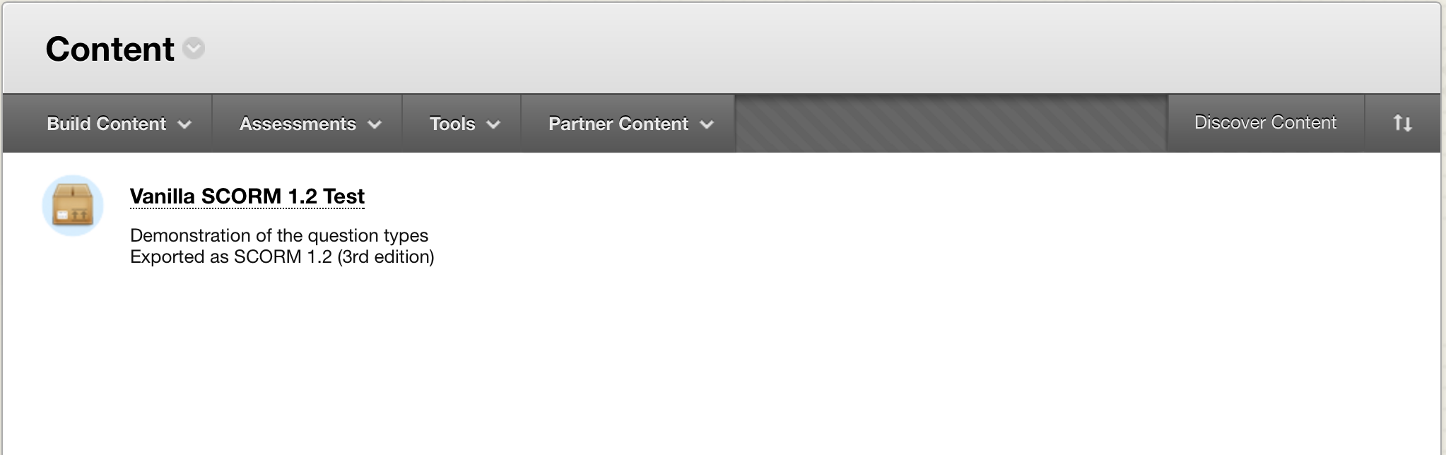
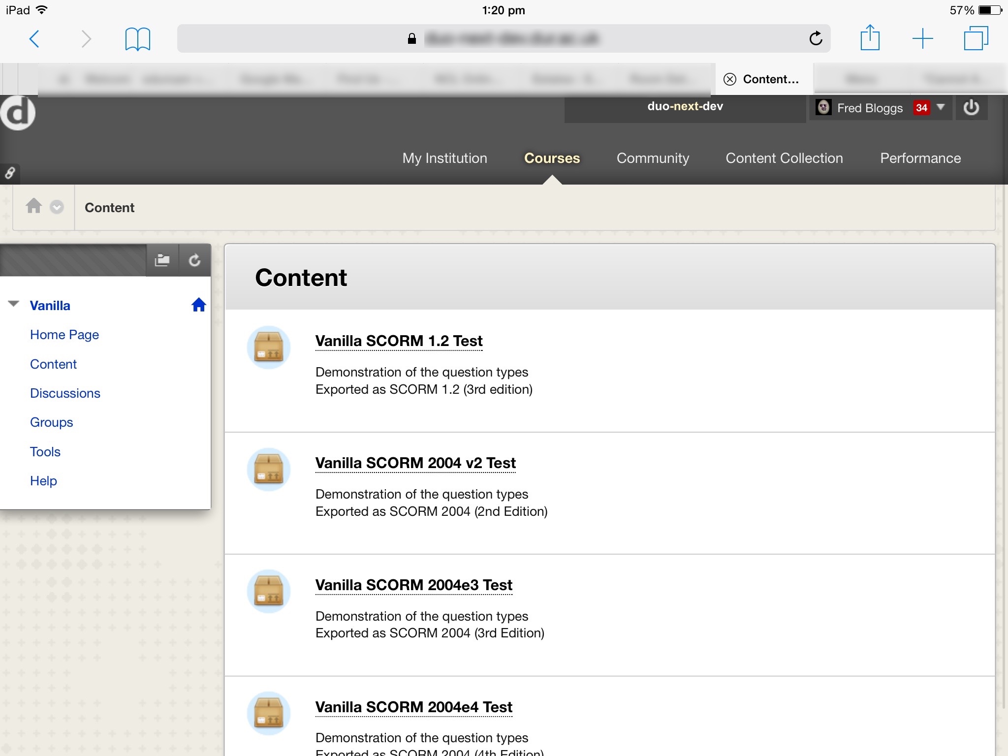
The Content
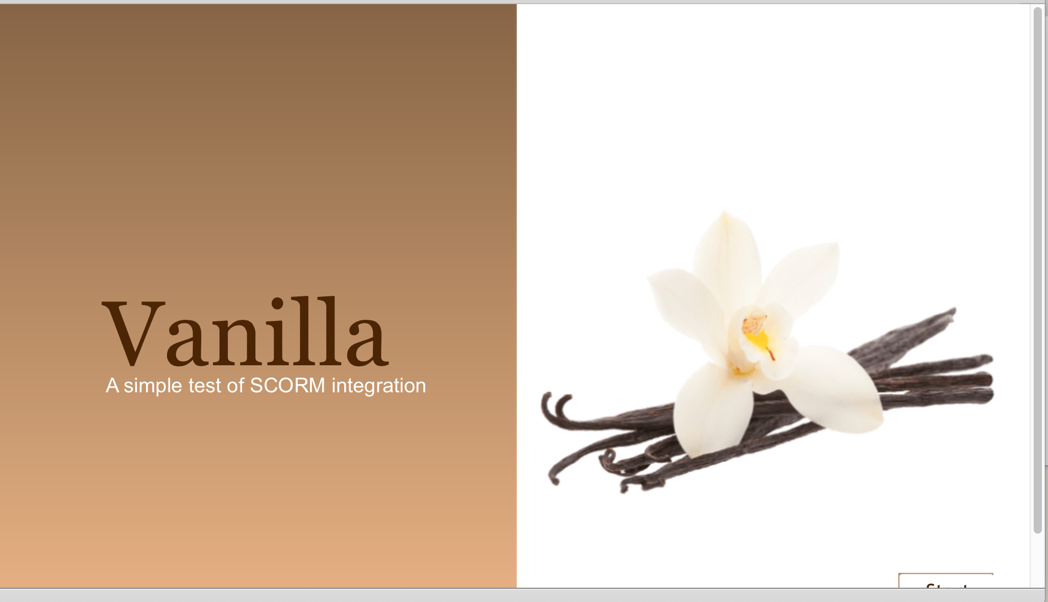
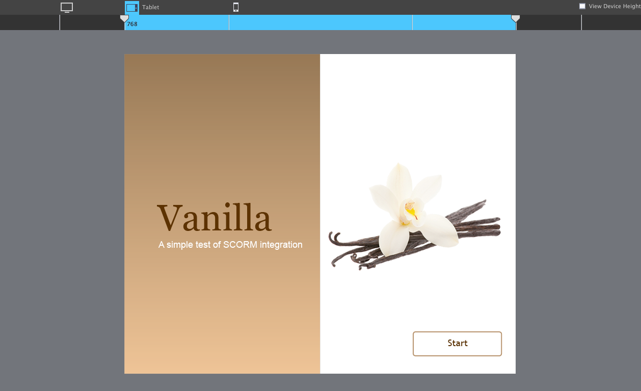
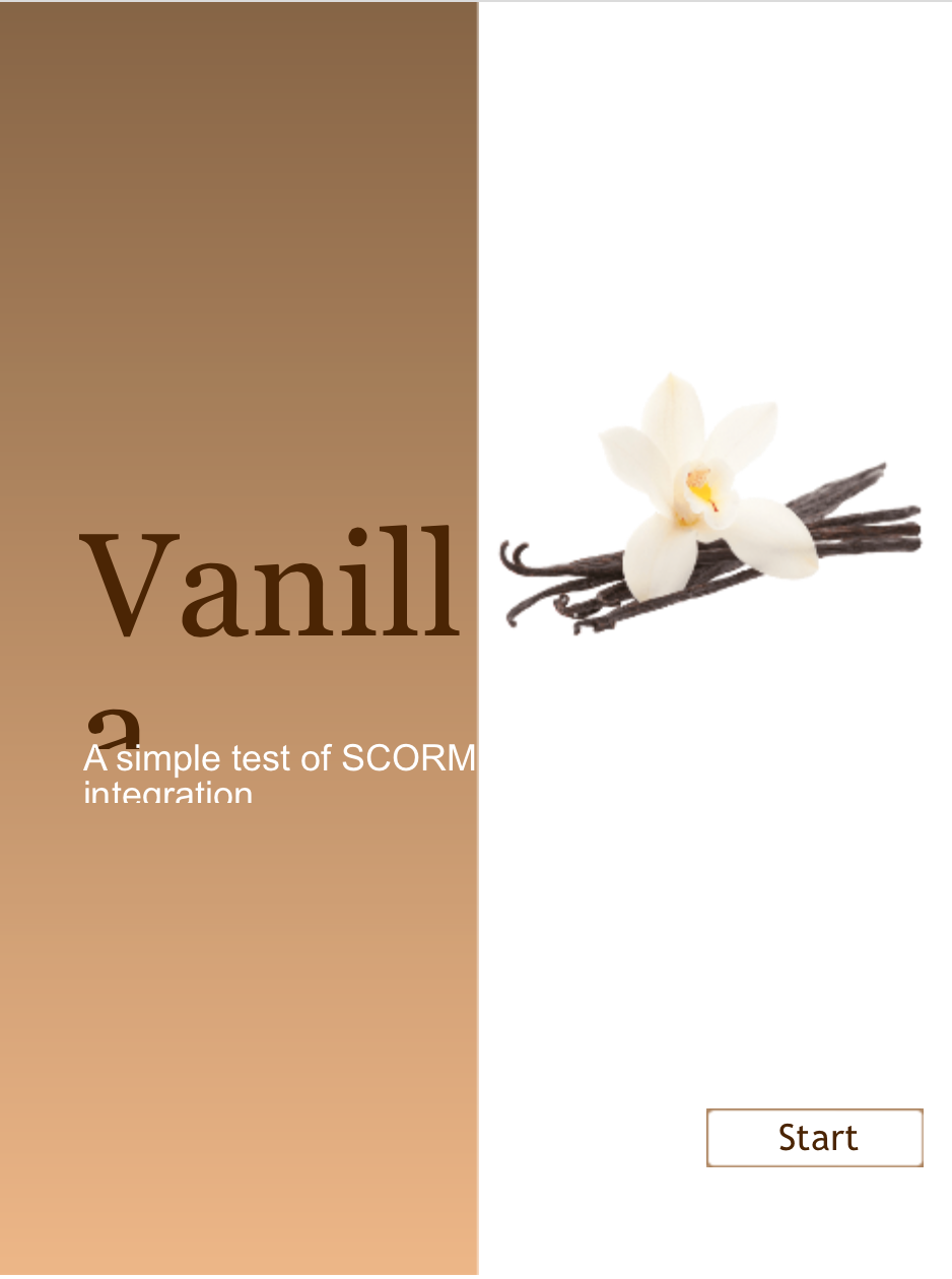
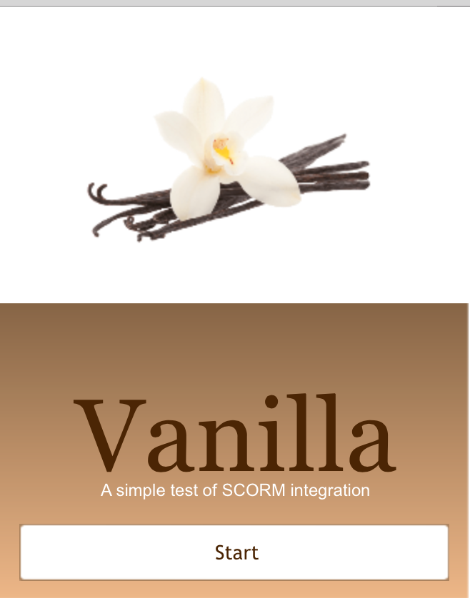
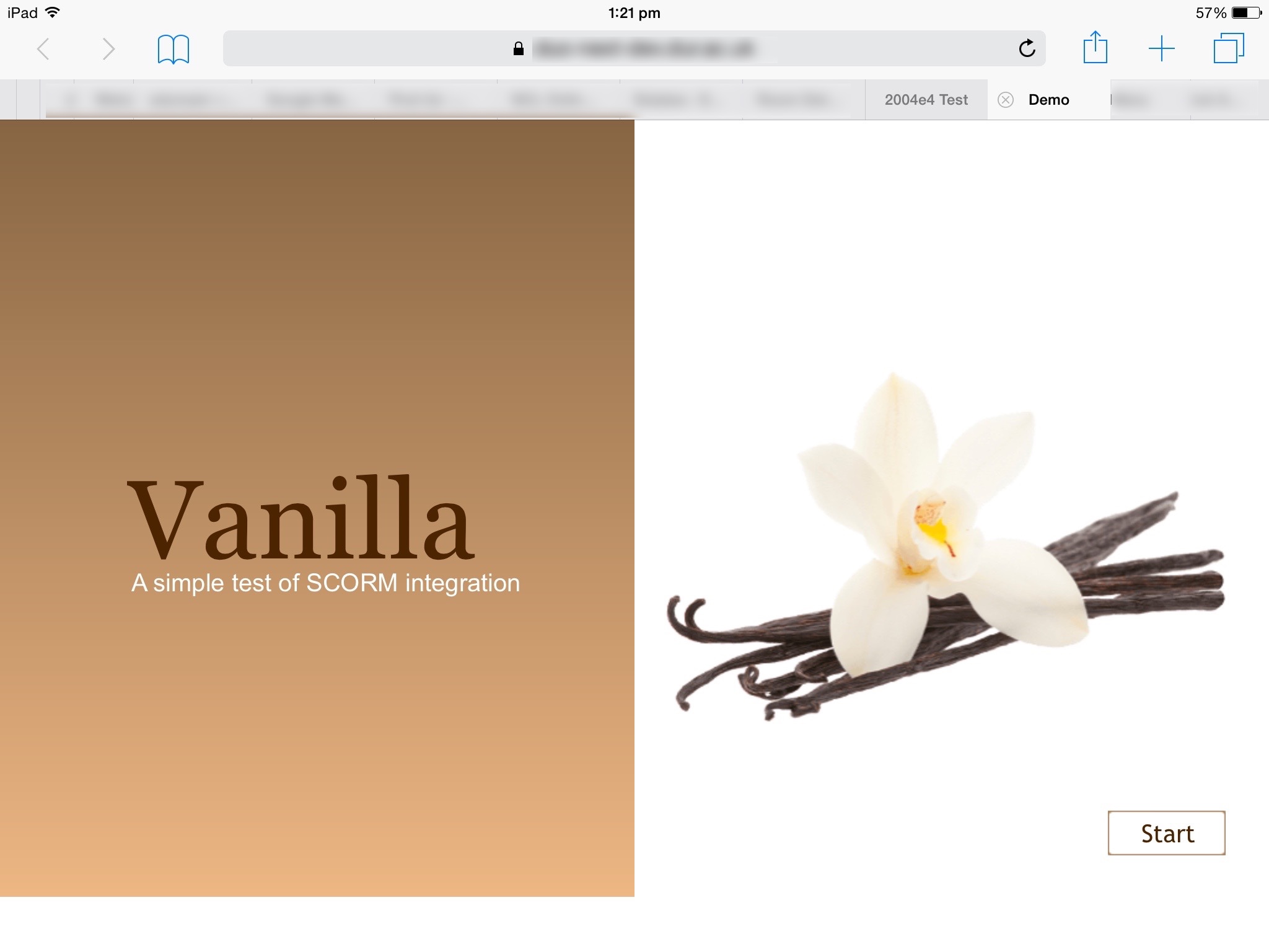
I created a simple object (which I called Vanilla) which uses a range of different question types. Some of these are drawn from pools, some are hard-coded into the object. In any run through, the user will be asked to answer eight questions, each worth 10 points:
- Multi-choice (single answer) question – 1 drawn at random from a pool of three questions
- True/False question
- Fill in the blanks question
- Matching question (three heads to three tails)
- Image hotspot question
- Ordering question (arrange the 7 steps of a process in the correct order)
- Multi-choice (single answer) question – 1 drawn at random from a pool of three questions
- As 7, with a different question drawn from the same pool.

Scoring Options
Before exporting anything, you need to define how a person passes the test. This is defined in the project Preferences. File | Project Info and then click on the Pass or Fail option down the LHS:
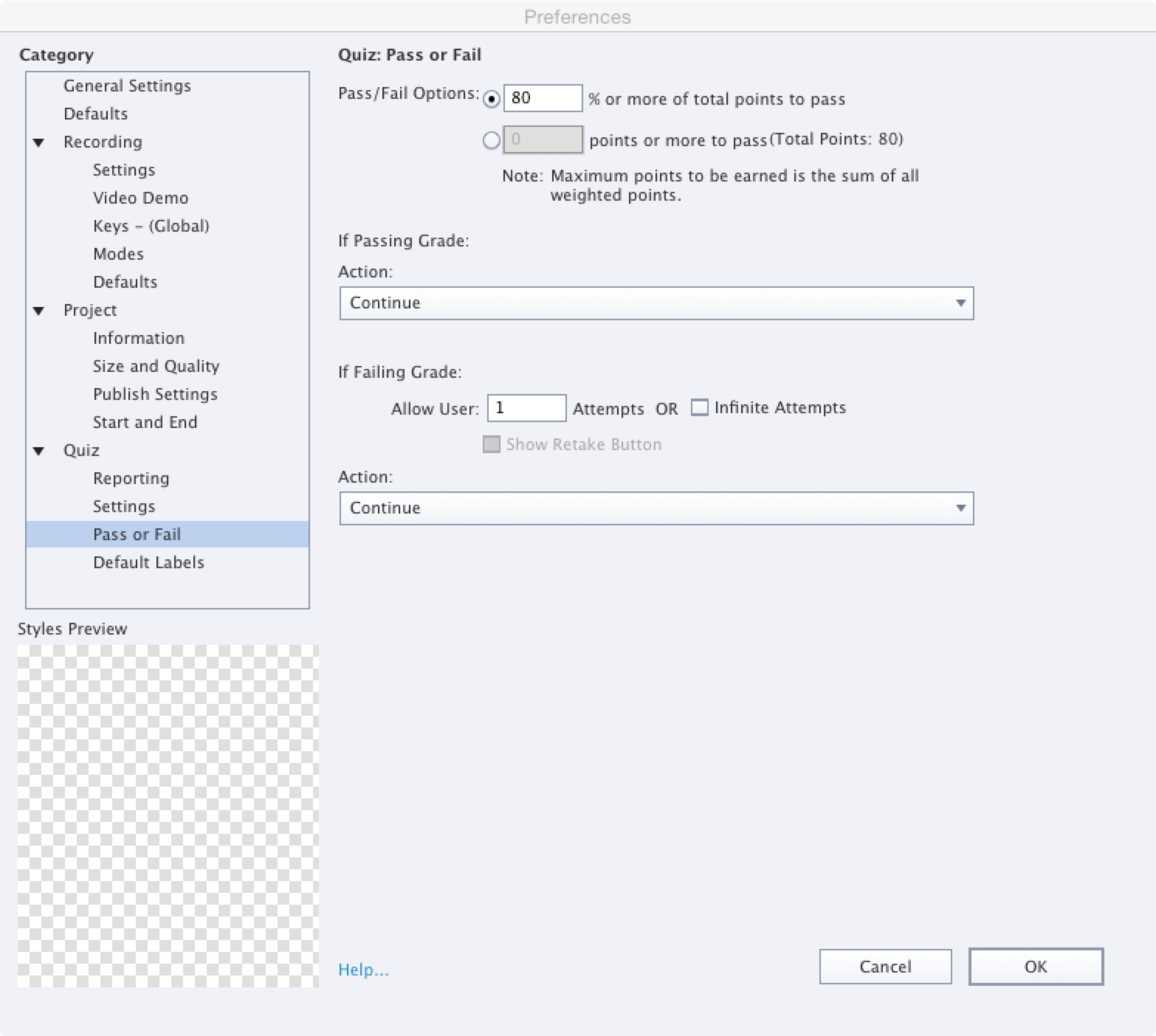
You can see here that we have set the pass rate to be 80% (pretty high). There is also the option to choose a numerical score as the threshold. The other options (relating to what happens if you fail and the ability to retake the quiz can be ignored for the purposes of this test). The next step – deciding what to report back differs depending on the SCORM flavour you use…
Export Options
A SCORM object can report (to the LMS, usually via the Grade Centre or equivalent) different measures, depending both on the SCORM flavour you use and the way you set it up. Typical fields it can report are:
- The Completion status (how many of the pages of content you actually viewed). When a SCORM course is launched, the status changes to Incomplete. It changes to Complete when the user meets certain criteria – the Completion Criteria.
- The Score of any quizzes taken
- The score and/or the completion status can also be used to derive a Pass/Fail flag
- Ideally, you also want it to provide details of the Interaction – how long people spent on each page, which questions they attempted (remember these may be drawn at random from a poll) and the answers they provided.
In the simplest case, the Completion Criteria might be just that the user has launched the package. It is more commonly defined as either viewing a certain number/percentage of slides and/or achieving a pass score in the quiz. In order to export content as SCORM you need to adjust the project Preferences. File | Project Info and then click on the Reporting option down the LHS:
SCORM 1.2
If you select SCORM 1.2 under the Standard select control the rest of the page looks like this:
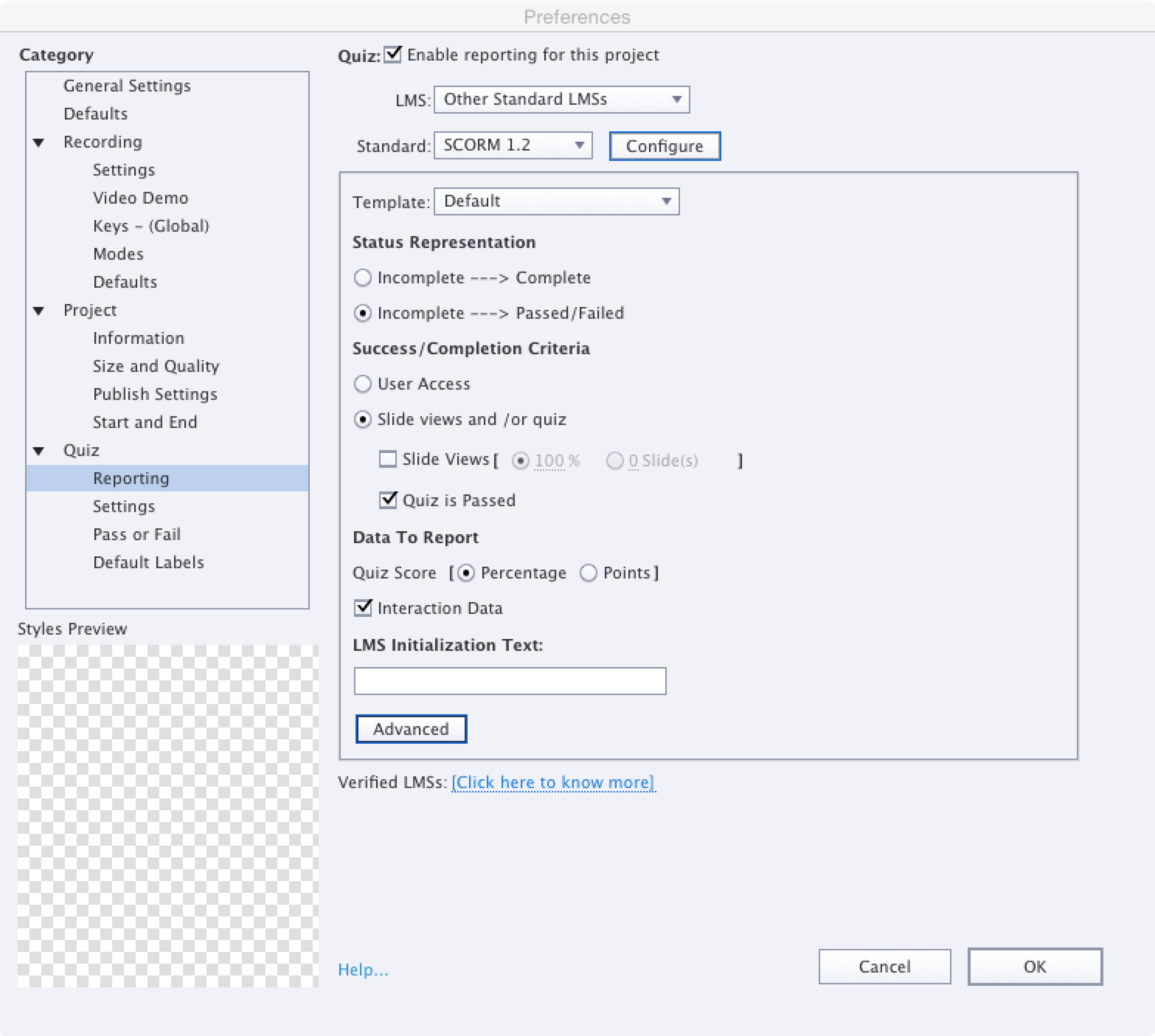
You can see that you can choose to simply report that a user’s interaction with the object is complete or incomplete, or go for the slightly more nuanced incomplete/fail/pass. In the second step – Success/Completion Criteria you can define whether you want to define a Pass in terms of User Access (either simply a percentage of slides viewed and/or passing the quiz). If you click the Configure button, you can see the values that will be written into the SCORM manifest file (these values are used when you deploy the content into the LMS):
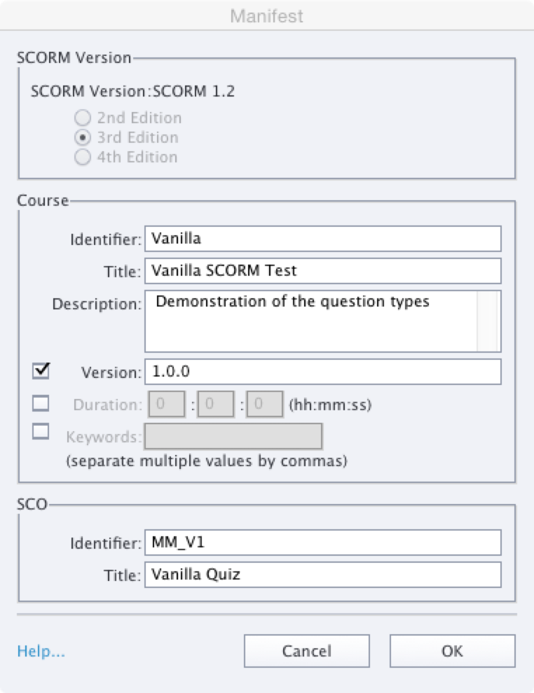 Note that you only have the option to export the 3rd Edition flavour of SCORM 1.2 in Captivate. It also only supports a single SCO (Sharable Content Object) within a project (actually the entire project), even though SCORM itself allows several. This restricts the reporting options, although in most cases a single SCO is adequate. The default Advanced settings are used in these tests:

SCORM 2004
If we select SCORM 2004 under the Standard, the page changes slightly: 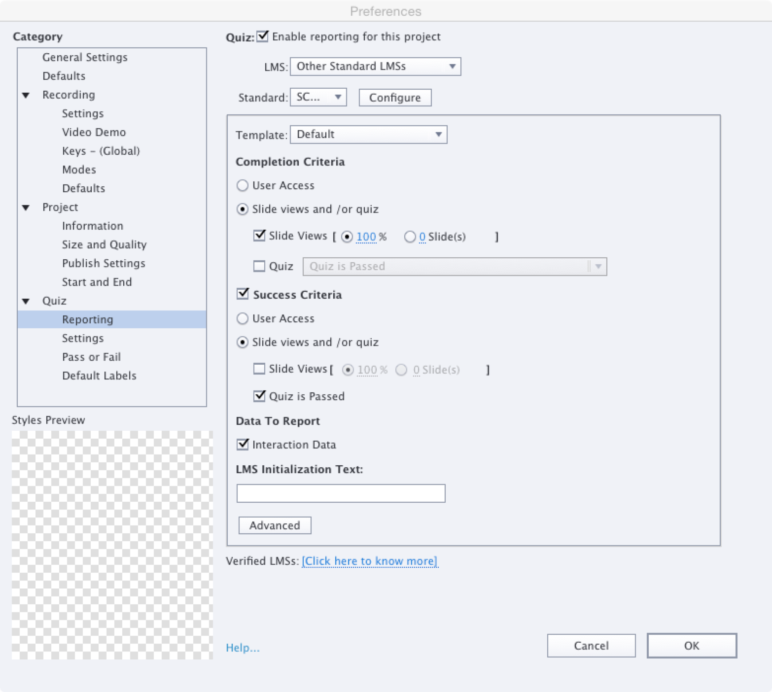 The Status Representation options seen in SCORM 1.2 disappears and instead we have the option to define separate Completion and Success criteria. This allows for the same level of reporting as the earlier incomplete/fail/pass option: incomplete = Completion criteria not met, Success criteria not met; fail = Completion criteria met but Success criteria not met; pass = both Completion and Success criteria met. You can define both criteria using test scores, number of slides viewed or just opening the package. In my case I have opted to define completion as viewing a certain number of slides and success as passing the test. Again there is the option to report the Interaction Data. If you click Configure, the dialogue displayed is similar to SCORM 1.2 but not that the user has the option to select their preferred version of SCORM 2004 – one of the 2nd, 3rd and 4th edition.
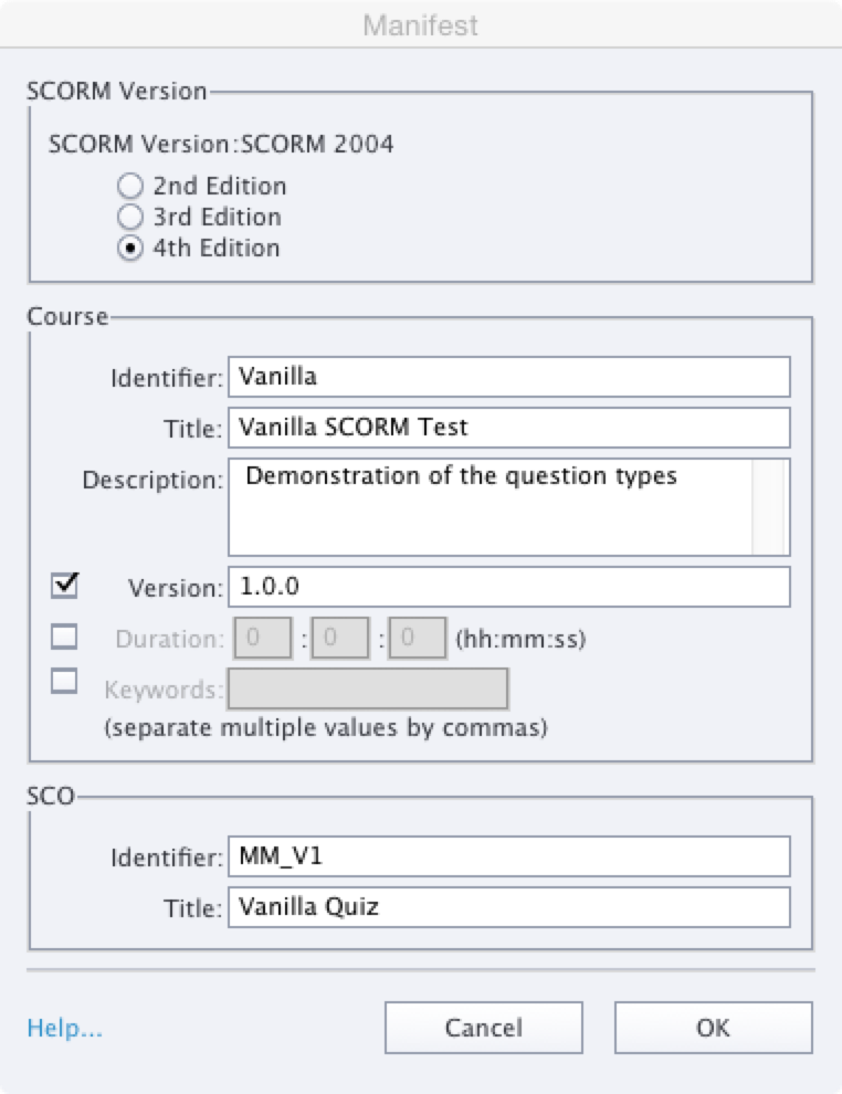
I chose to use the latest one. We left the Advanced settings at defaults (as with SCORM 1.2). For testing I published three SCORM 2004 versions, one for each edition available in Adobe Captivate.
Publishing the Content as a Zip File
Regardless of SCORM flavour, the process of publishing the content is the same: File | Publish…
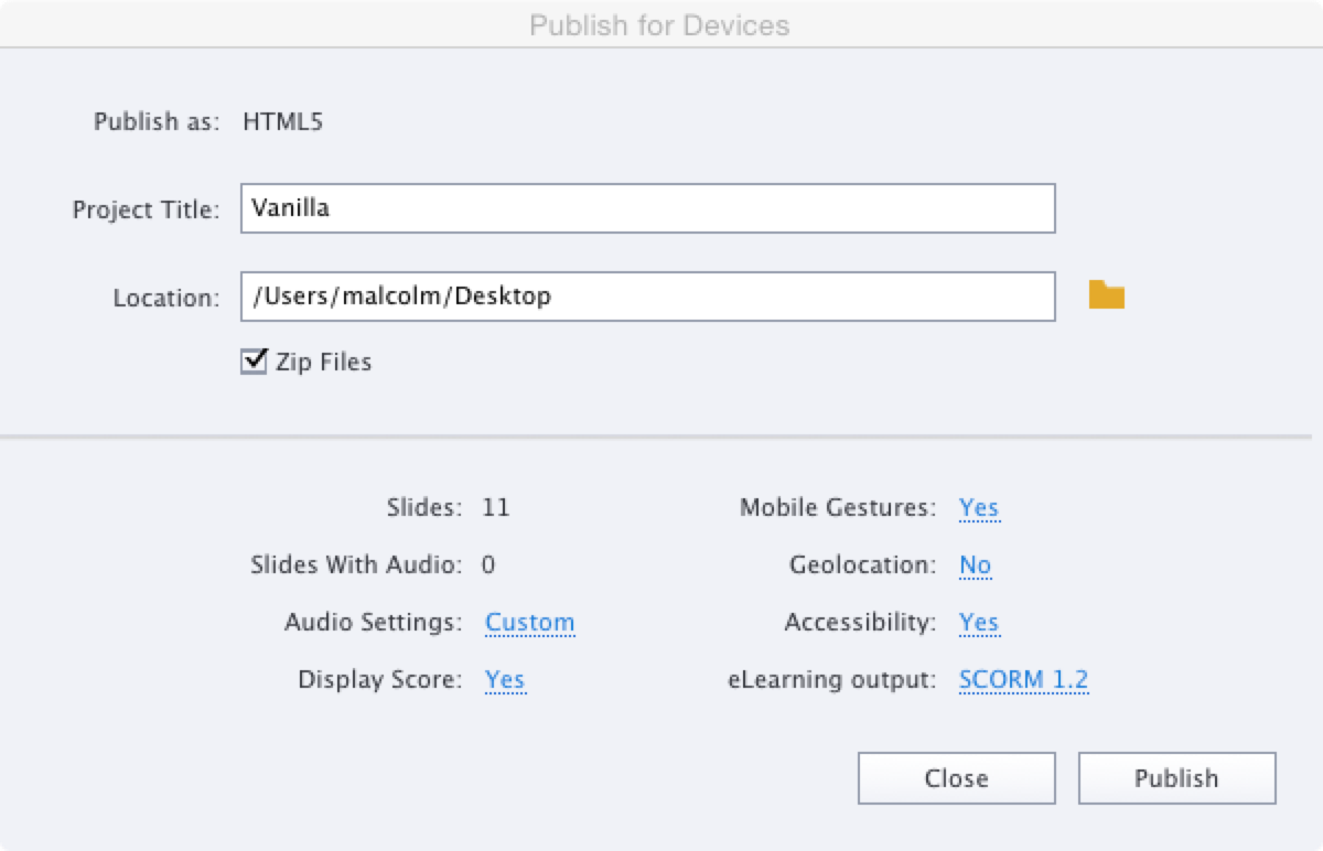
Note that the option to Zip Files is ticked. In summary, at the end of the tests I had four SCORM packages:
- SCORM 1.2 3rd Edition
- SCORM 2004 2nd Edition
- SCORM 2004 3rd Edition
- SCORM 2004 4th Edition
Deployment Options
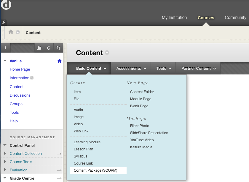
The content was added to a new Blackboard course as a Content Package (SCORM) – this is the custom content type defined by Rustici’s building block:
You are prompted for the location of the zip file you published:
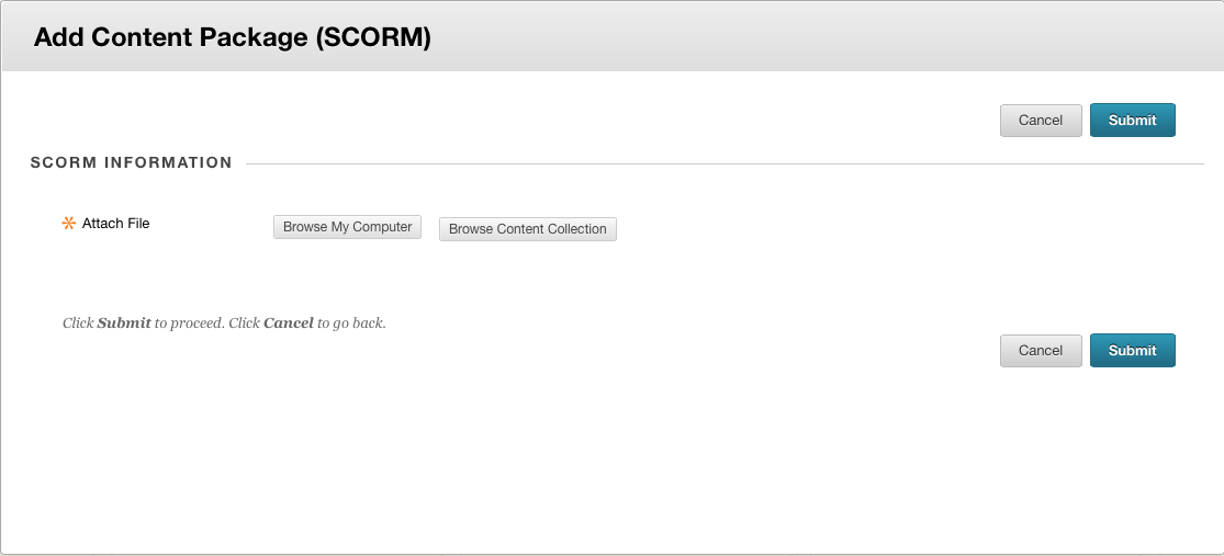
after selecting the file, I clicked Submit to upload it to Blackboard where the manifest file is parsed. The first part of the form reads the descriptors from the manifest and asks you to confirm the details displayed to students: 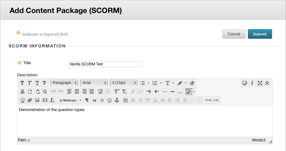
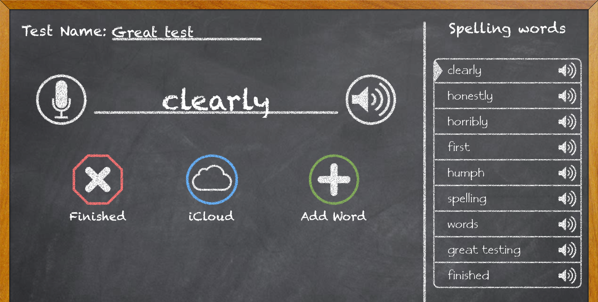
Note the fact that the Title and Description values are taken from the manifest using the values you typed into the Configure box above. The second section determines how users can interact. After thanking the developer for selecting “No” as the default option for Make SCORM Available (can never get enough radio button clicks) then it’s down to the attempts. For these tests I am going to allow an unlimited number, without any date restrictions. There is no sense in turning tracking on as you will get much better data from the SCORM object itself when you open the Grade Centre. 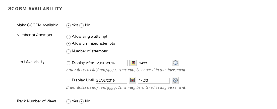
The third section is where you define the integration with the Grade Centre (unless you choose the option No Grading). Note that even if the content doesn’t have a quiz baked into it, you could set a simple score related to completion that would indicate the people who had worked through it. Blackboard users note, the Title setting here is what is used to name the Grade Centre column. Given the multiple flavours of SCORM that I am testing, I will have to be careful here and use one of these names each time:
- v1.2
- v2004e2
- v2004e3
- v2004e4
Keeping them short is a vain attempt to reduce the scrolling in the Grade Centre. I’m selecting to use the SCORM Score as the Grade, so I will see how well people have done in the quiz. The Grade SCOS (which should read Grade SCOs) section can be left at No as this captivate content can only ever have one shareable content object, so there is no need to provide separate scores for each part. I am leaving Grade Timing at showing the Grade of Last SCORM Attempt (though you can get them all via the Grade History). 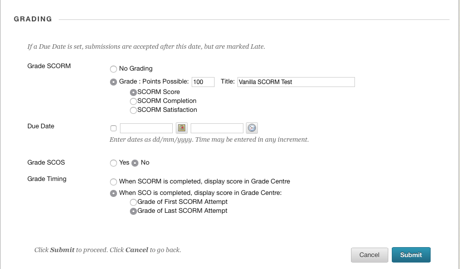
Finally clicking the Submit button creates an entry in Blackboard
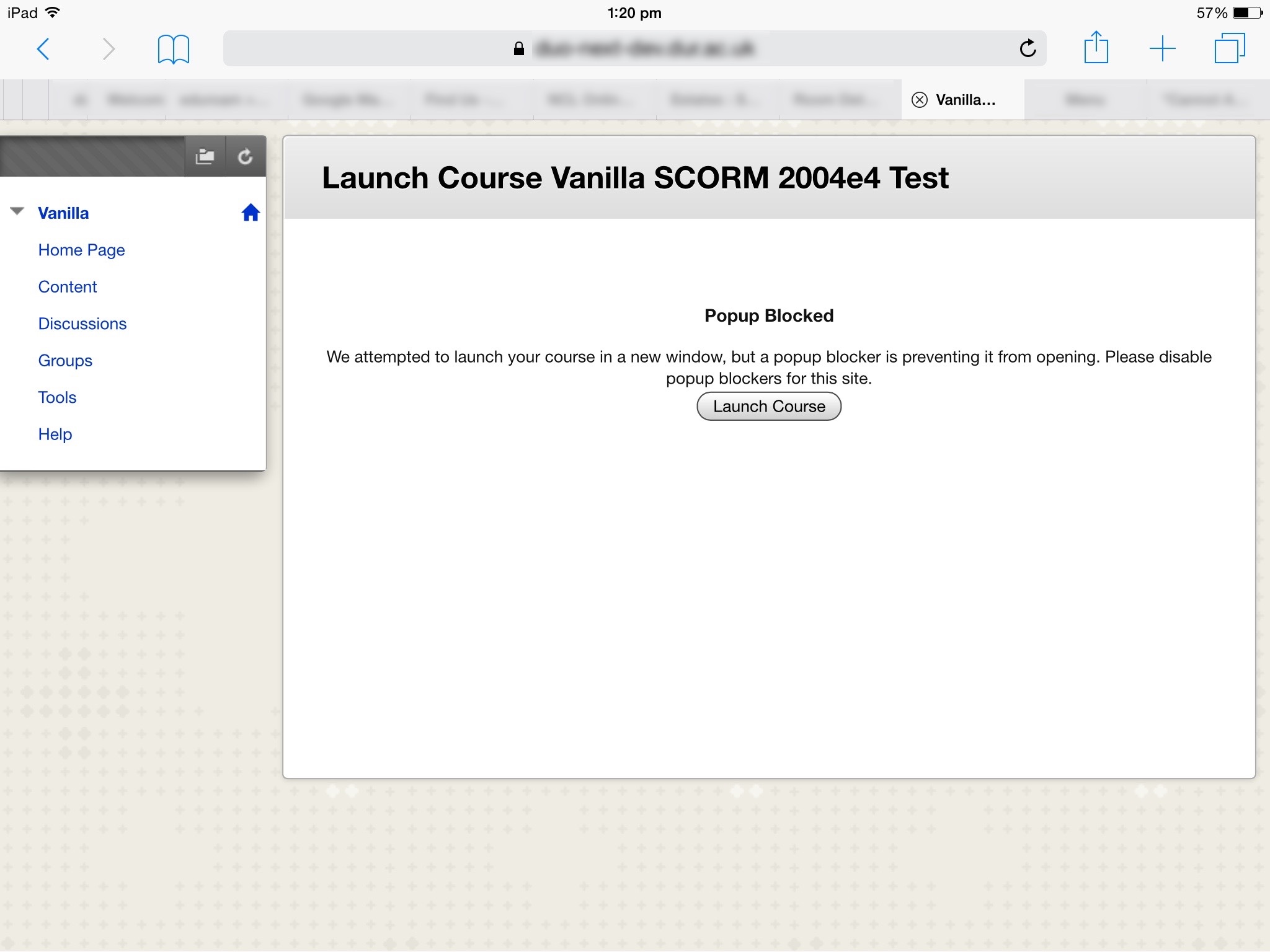
When you click the link, the chances are out the box it will not behave as you wish. In my case, it opens as a new popup window that is not quite the right size:
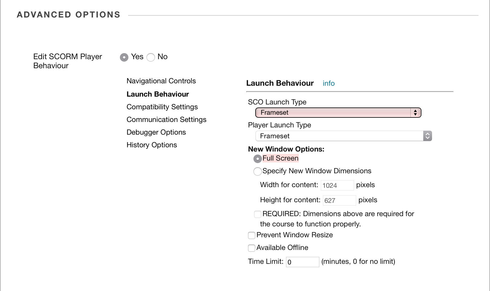
To sort this, you need to edit the content again in Blackboard and make use of a feature that only appears after initially submitting it and does not conform to the Blackboard UI style manual (oh yes there is one!) Below the SCORM AVAILABILITY entry there is now a new entry ADVANCED OPTIONS:
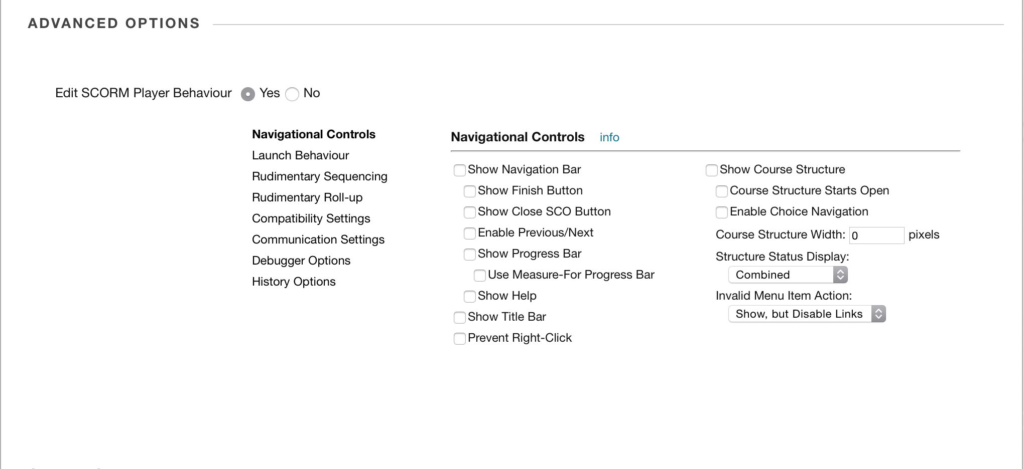
If you change the radio button to Yes, a whole heap of extra options are displayed
The first set relate to the Navigation Controls – these can be important if you want to show/hide the course structure down the left hand side, or display a Close button at the top of the screen:
Clicking any go the other text below the radio button, e.g. Launch Behaviour gives you more options.
This is where you can set the size of the opening window. The page helpfully highlights any changes in a pretty shade of rose pink:

That’s it sorted now.
I then repeated the process for the three SCORM 2004 flavours.
Note that as far as configuration within Blackboard goes, in this case the same settings can be applied to all four flavours.
Note, later I explored these settings in more detail. I came across a variable that sets the SCORM edition under Compatibility Settings:
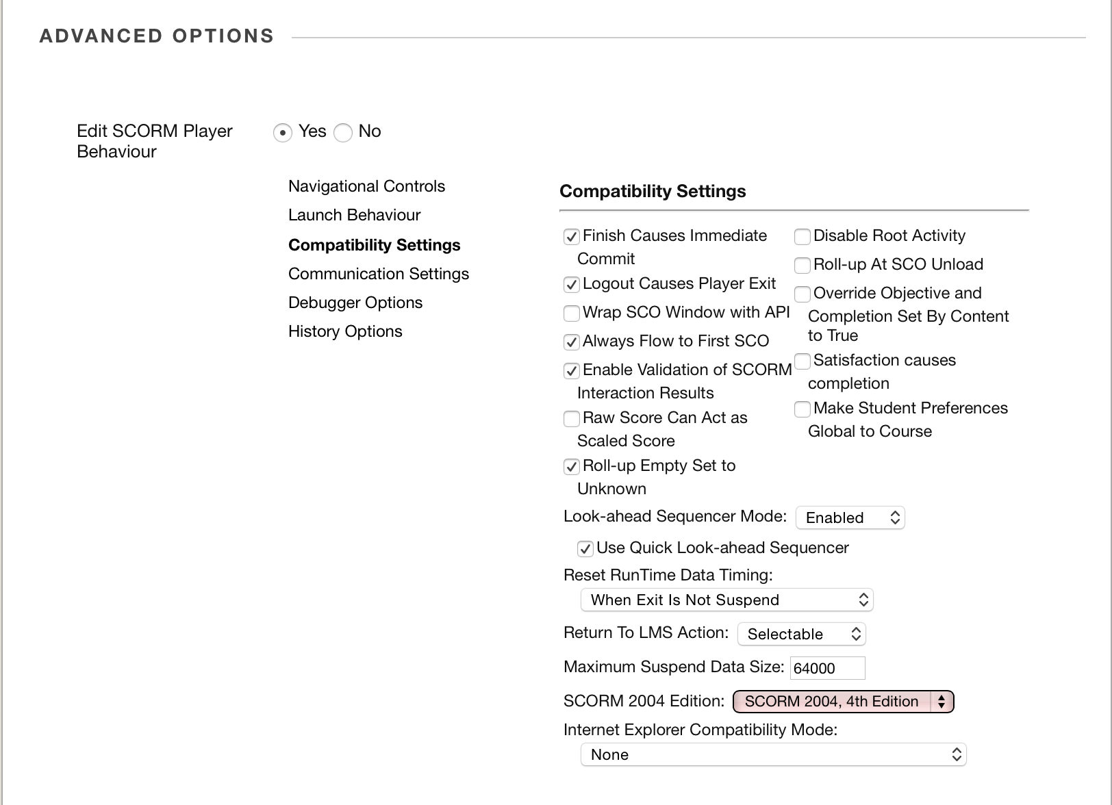
I was not impressed that this was not set correctly by default for the SCORM 2004 items – it seems to default to the 2nd Edition 😦
On the up side, changing this did not seem to make any difference to the content item’s behaviour.
The SCORM 1.2 did not have this setting, so at least it detected that correctly!
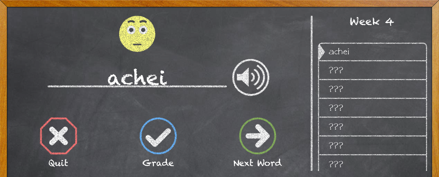
Completing the Tests
I then logged in as a student and completed the four SCORM objects. You could not tell the difference from the user perspective.
I will come back and look at the experience using a range of devices (laptop browser, mobile browser and mobile app).
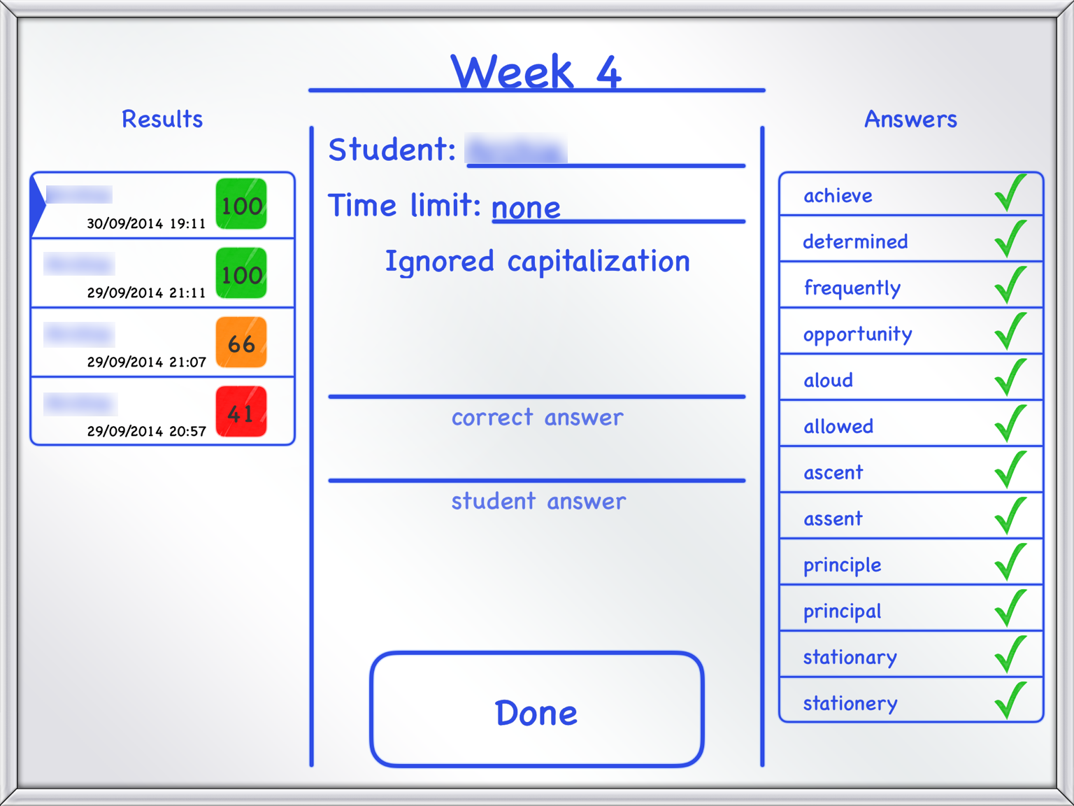
Logging back in as an instructor, I can see the entries for each SCORM item in the Grade Centre:

To see the detail of any given attempt, you have to select it using the context menu at the right hand side of the entry:

To cut to the chase, there is a difference in the data displayed from SCORM 1.2 and SCORM 2004 items, but no difference between the various SCORM 2004 flavours:
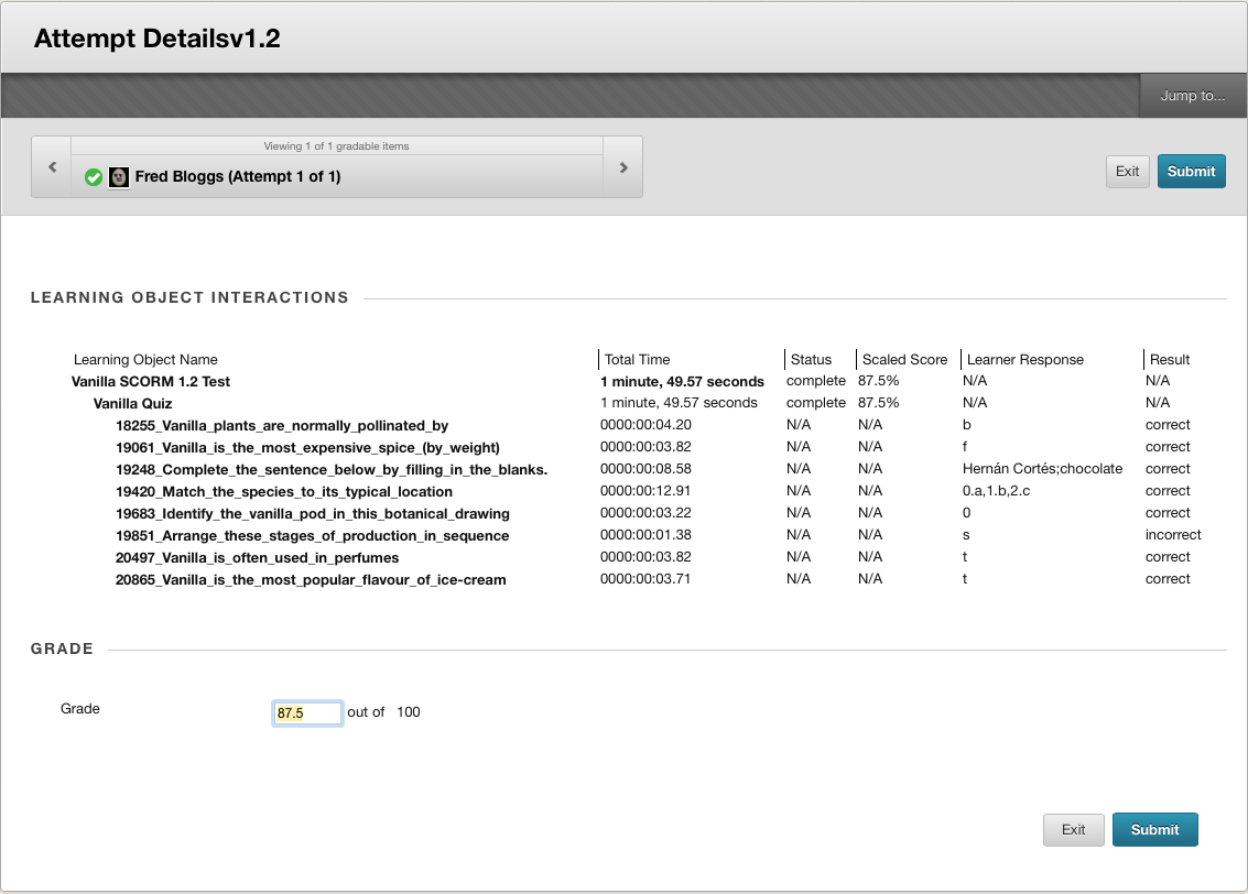
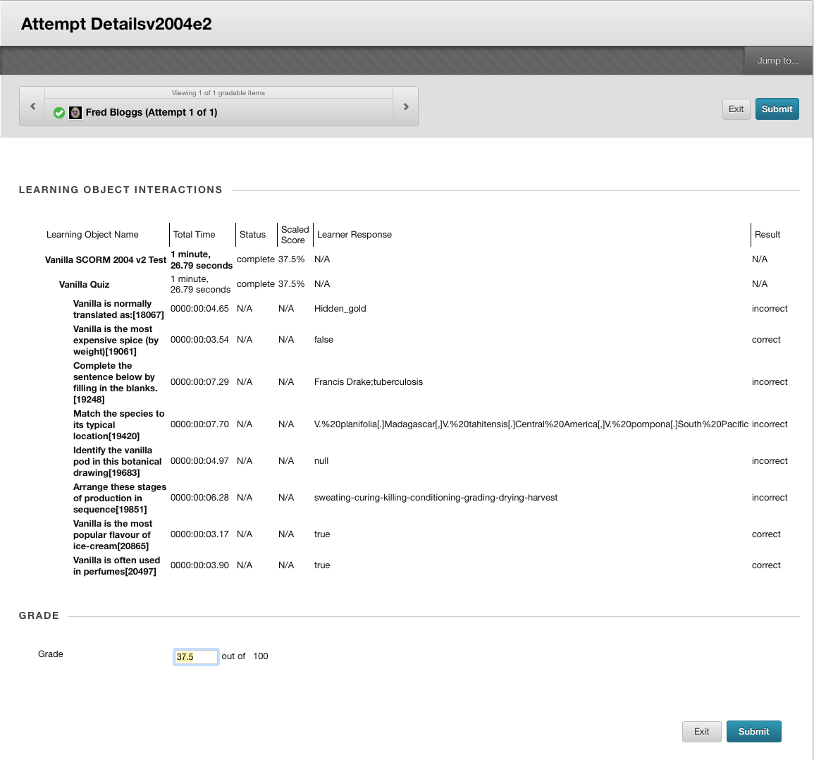

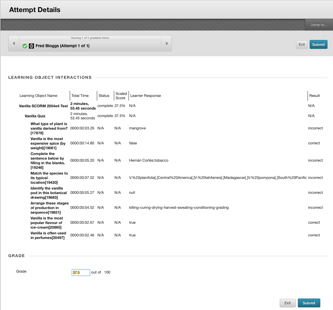
The key advantage of the SCORM 2004 format is that you see the text of the answer selected by the user, rather than just an identifier (e.g. a, b, etc.).
The utility of the response varies by question type. For text responses it is easy to see which response the learner chose and whether it was correct, but for some (e.g. hotspots, where just the co-ordinates are displayed) or ordering (where you need to parse (URLDecode) the entries selected) you need to pay much closer attention.
It is interesting to see how long a student spends on each question.
That’s about as good as it gets though. There is no overview available across all the students on the course, no ability to analyse the effectiveness (discriminatory power) of the individual questions.
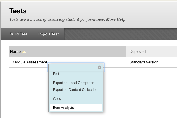
Item Analysis
Compare the results above, with the sort of analysis that comes out the box for the much-derided Blackboard Quiz:
From the Control Panel in a Course:
Course Tools | Tests, Surveys and Pools | Tests
and from the context menu next to the corresponding Test choose Item Analysis
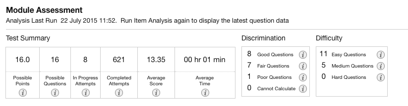
Running the analysis can take some time (especially if the class contains a lot of students) but the results are worthwhile.
In the screenshots below I am displaying Item Analysis results for the same questions used in the SCORM package, but deployed as a Blackboard Test.
The Item Analysis starts with a summary of the test, how many people have taken it, and an indication of how individual questions score in terms of difficulty (the percentage of students who answered it correctly) and how discriminatory (the ability to discriminate between students who know the subject matter and those who don’t based on the response to this question) they are.
Below the table is a list showing the results for each question in detail. You can filter this, e.g. to show just the questions with a poor discrimination value:

After applying several filters to get a feel for the data, you can drill into each question to see the statistics behind these measures:

In this table we see columns of figures. The first shows the breakdown of responses across all learners. E.g. 3.87% of all the people who worked through this material thought (wrongly) that Vanilla translates as “Nectar of the gods”.
The remaining columns show the responses selected for four groups of learners, grouped by their final score. So we can see that none of the people whose final score placed them in the top 25% (Q1) chose the option “Nectar of the Gods’, whilst 15 of the people in the bottom 50-75% (Q3) selected it, and 6 of those in the lowest 25% (Q4) chose it. This information is very useful when you come to review the questions.
It would be great if this information was available from SCORM content too, but at least in the Blackboard implementation, this information is not available.
Recommendation
I think SCORM can be used to deploy custom content, to convey information, introduce new ideas and help students assimilate this information into their own mental model. If you are only interested in the final numerical result, then it makes sense to include a test within the SCORM content. SCORM 2004 provides better reporting than SCORM 1.2.
If, however, you want to be able to refine the questions and possibly tune the training materials based on repeated wrong answers, then I think at present it is better to decouple the quiz from the SCORM object and deploy it as a separate stand alone test (possibly only visible once the learner has completed the SCORM packaged content at least once). This also gives you more flexibility should you want students to retake the test later and possibly revisit the materials if they fail the test the second time.
Device-Dependent Display
I also wanted to test the way the content was deployed using a range of configurations. The Captivate project used a responsive template, so the content uses one of three defined layouts, with break points defined at display widths of 1024 pixels (desktop), 768 pixels (tablet) and 360 pixels (mobile):


To test this I launched the course using a laptop and a tablet. I considered using a mobile phone too, but I think this form factor is really too small for much e-learning content. For the laptop I wanted to see the effect of resizing the window. For the mobile devices, I wanted to see if it reacted to a change in orientation.
Standard Browser
The link appears as a normal content item:

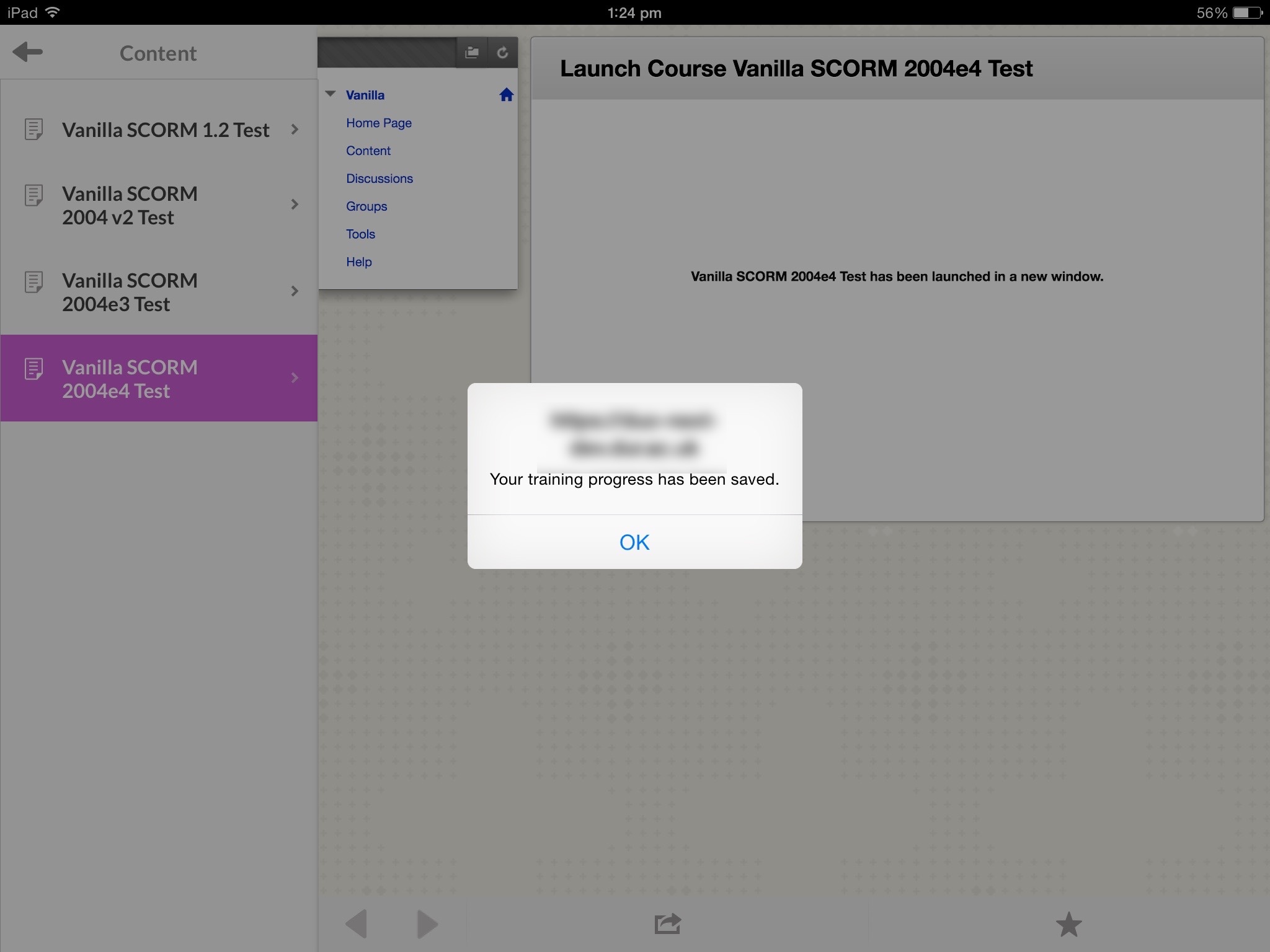
Clicking the link causes a new window to open. The SCORM content plays in this, filling the screen. The content of the window underneath is repainted to show that the SCORM player has launched in a new window.

When you have worked through the materials and close the SCORM player (And so it’s window) , there is a short delay, then the remaining window is updated, returning you to the content items again.
I then tried resizing the popup window to see how the content layout responded.
When I started narrowing the window width, the content did resize to a layout more like the Tablet option set in Captivate:
When I continued to reduce the width, it eventually flipped to the Mobile layout:
As such, although with a few layout issues, the SCORM content is acting in a responsive manner when viewed on a desktop/laptop.
Mobile Browser
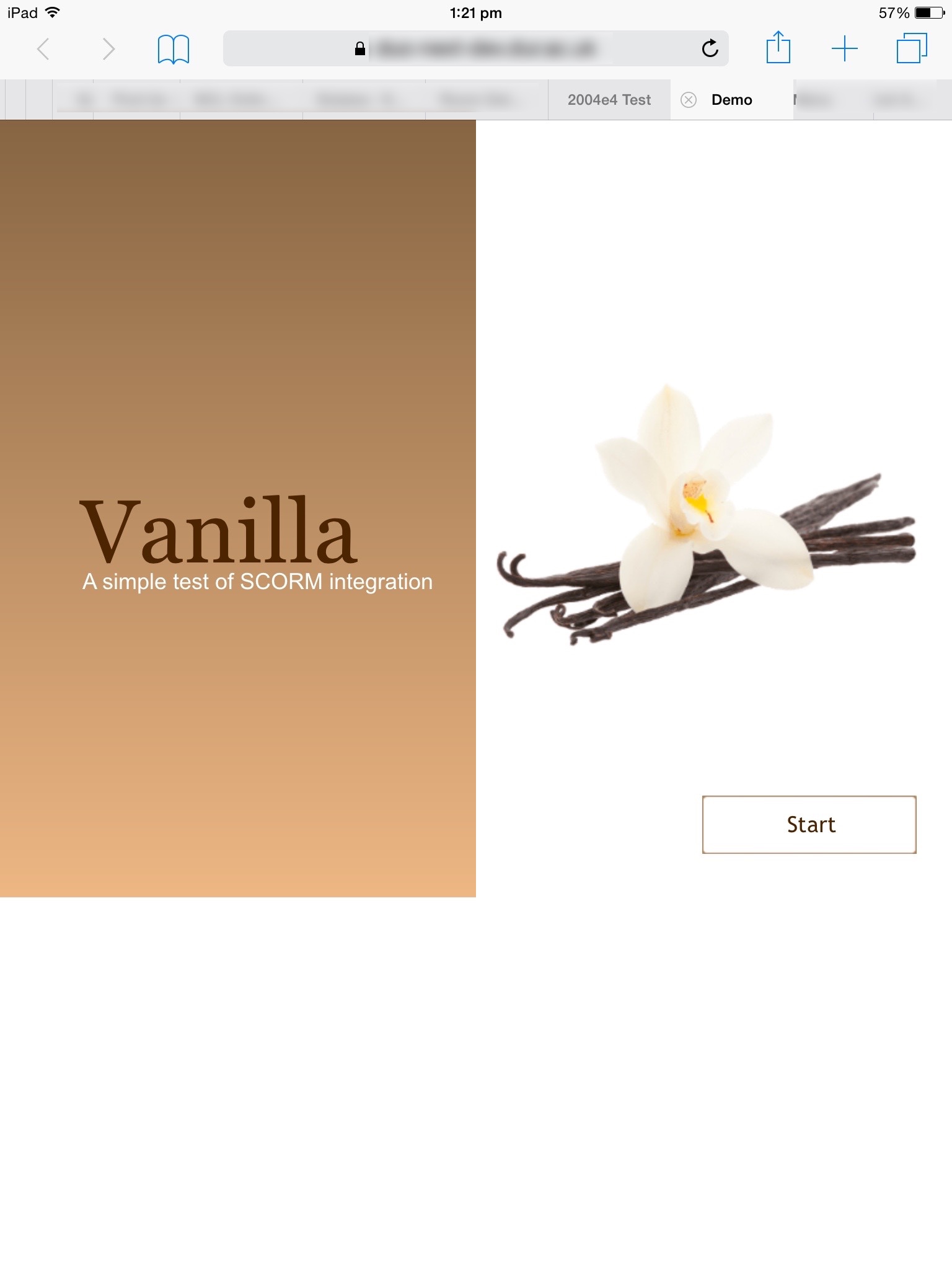
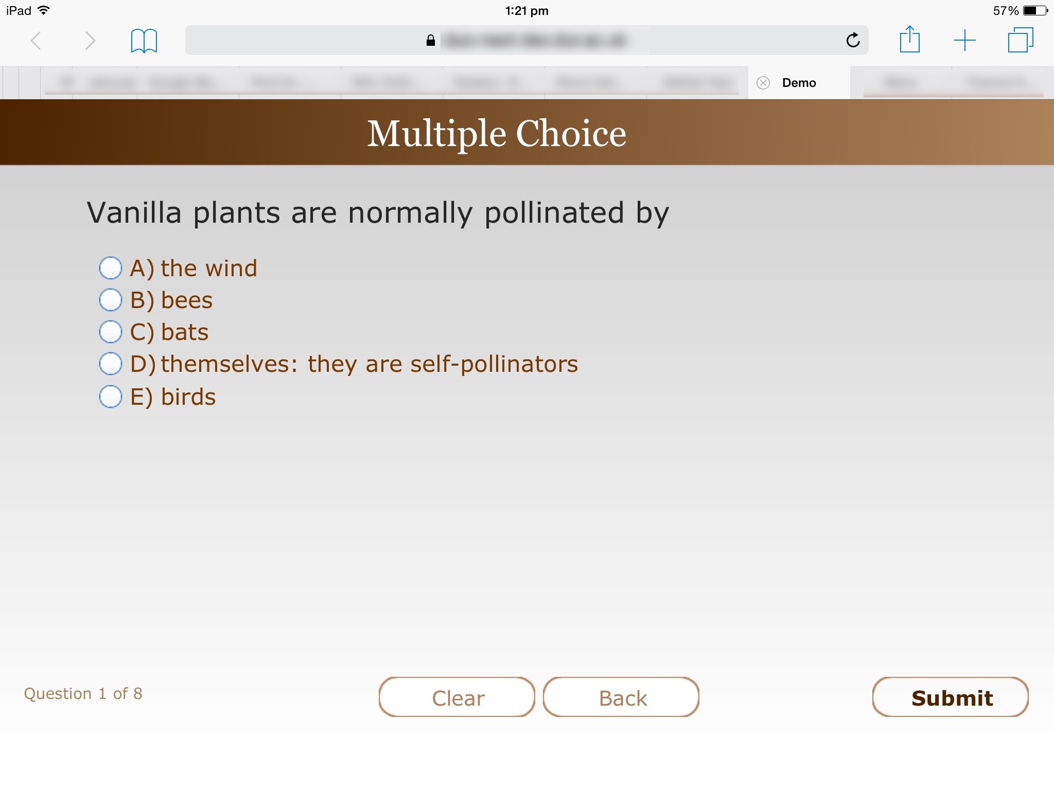
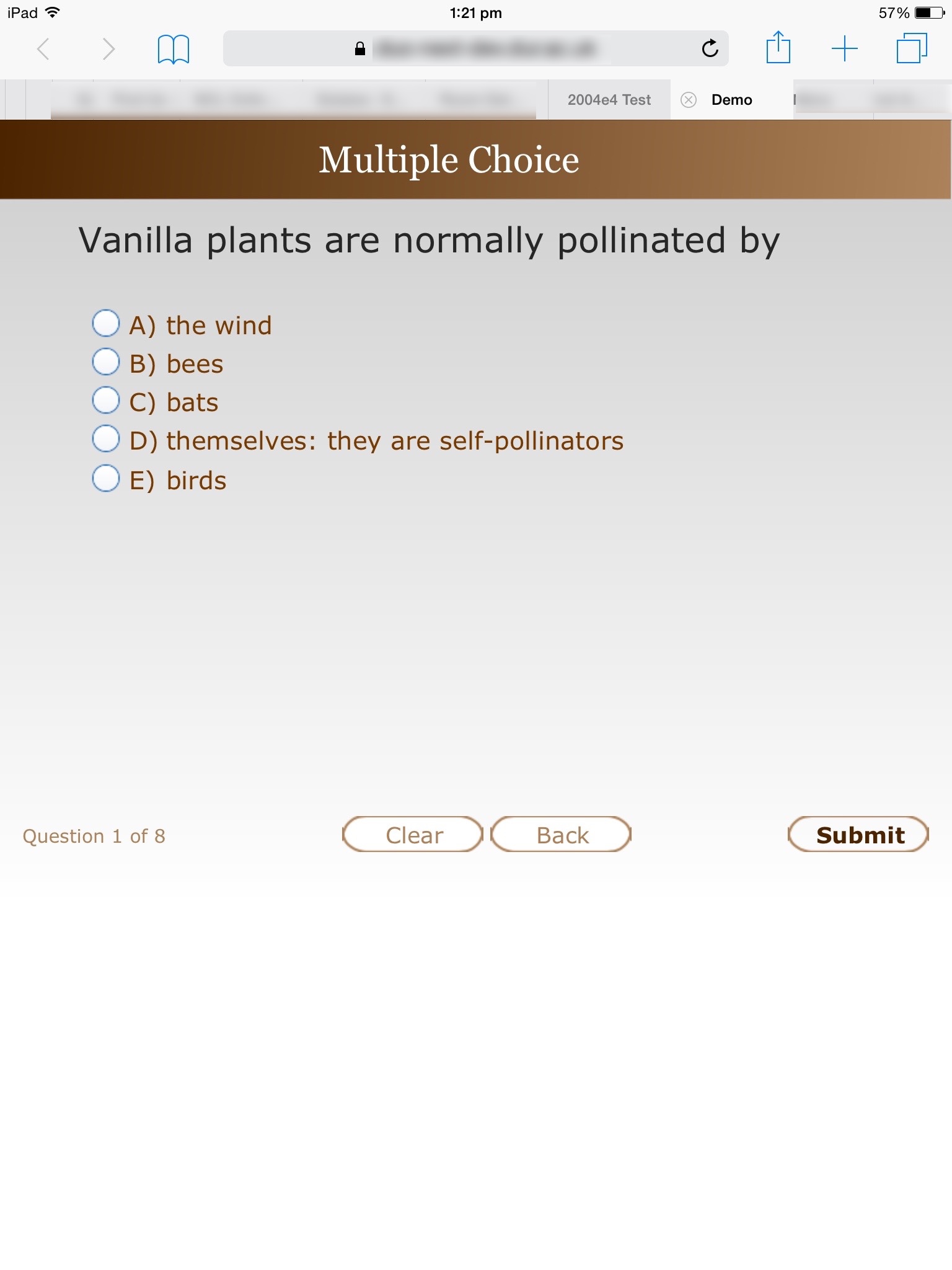
This test was carried out using an iPad, accessing Blackboard using the built in Safari browser:
Things didn’t quite go as expected when I clicked the link to open a SCORM item. Instead of a new window I got this:
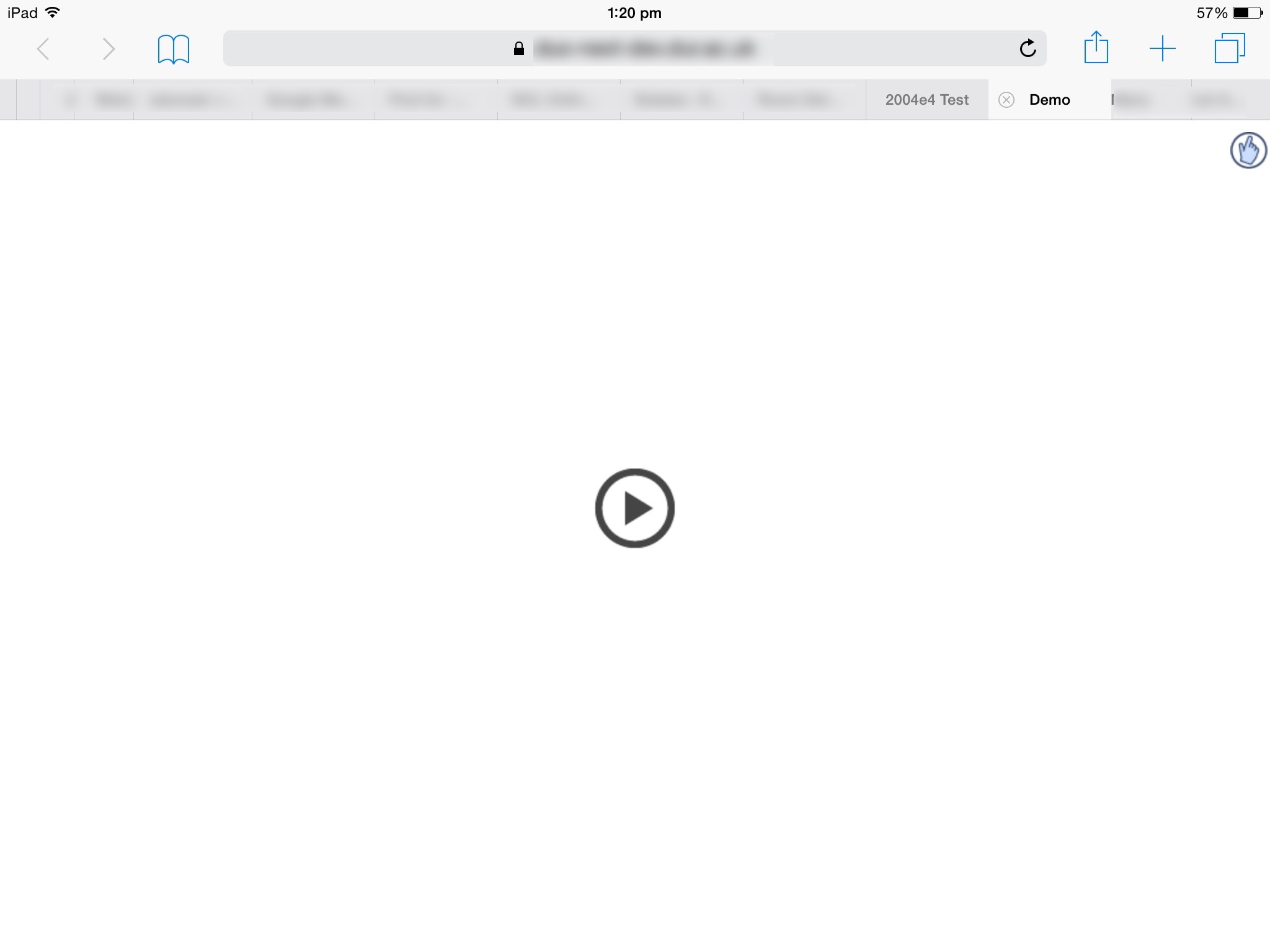
If I then clicked the Launch Course button the player is launched.
Unlike the desktop browser though, the opening screen is intercepted with this standard Captivate screen designed to provide help for mobile users:
If you click on the Gesture icon, these instructions are displayed:

Click the screen again to dismiss this information, then click on the player icon to finally launch the content:
If you rotate the tablet, the content is flows to (at least partially support) the portrait orientation:
When you have finished working through the content and close the SCORM object, you are returned to the course as before.
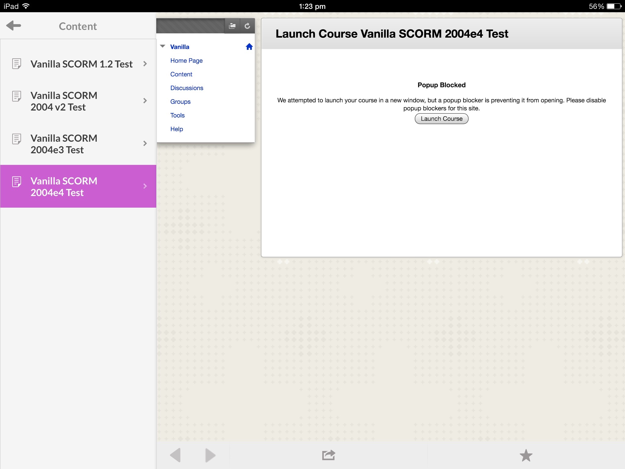
The popup blocker annoyed me, so I went to the Settings for the iPad and searched for the options for Safari. Sure enough there was a Block Pop-ups option:
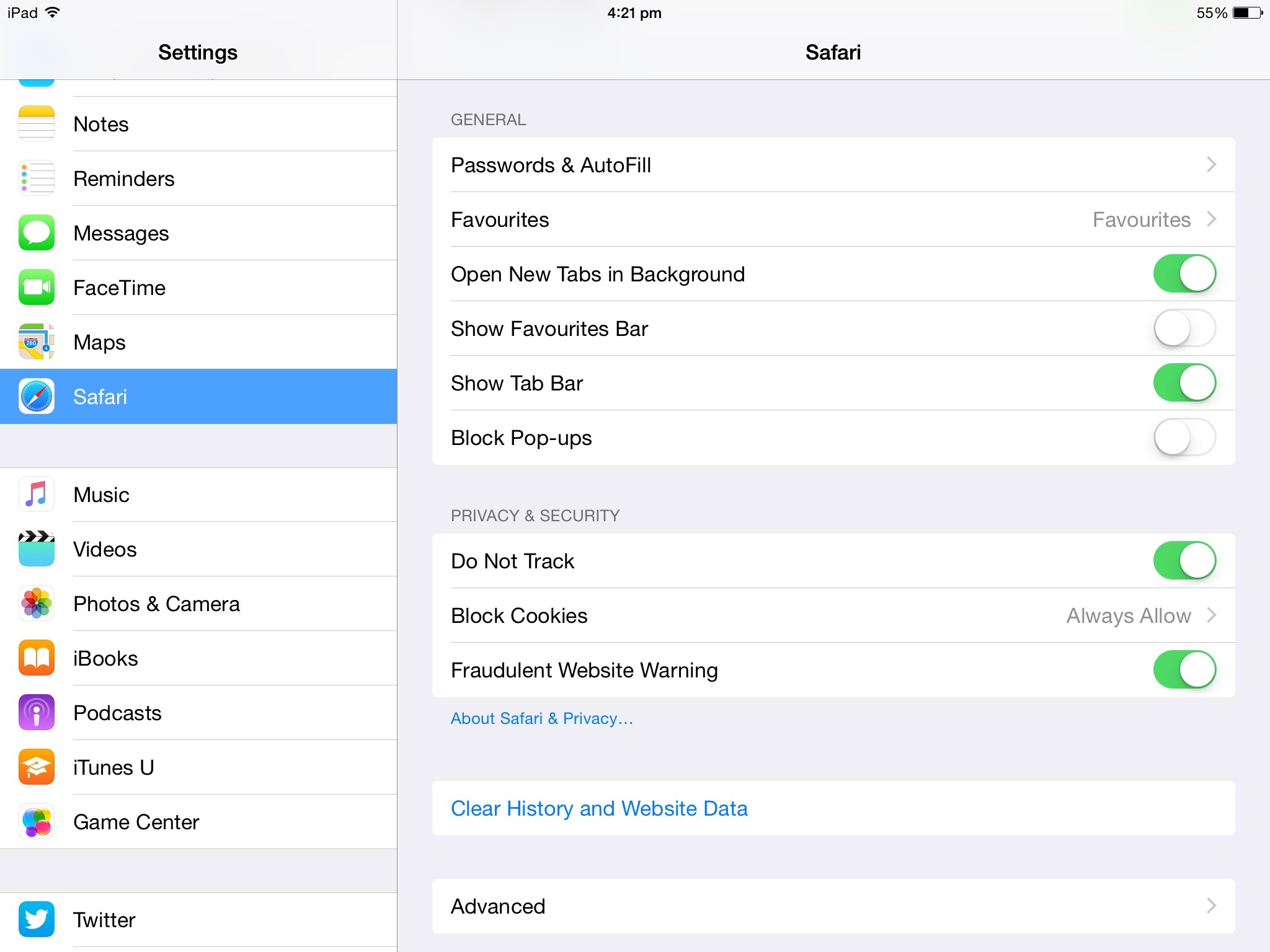
With this set duly to OFF I tried launching the content again. I expected the file to open, but no, there was a further surprise. Now I was presented with a dialog box asking me to conform the popup.
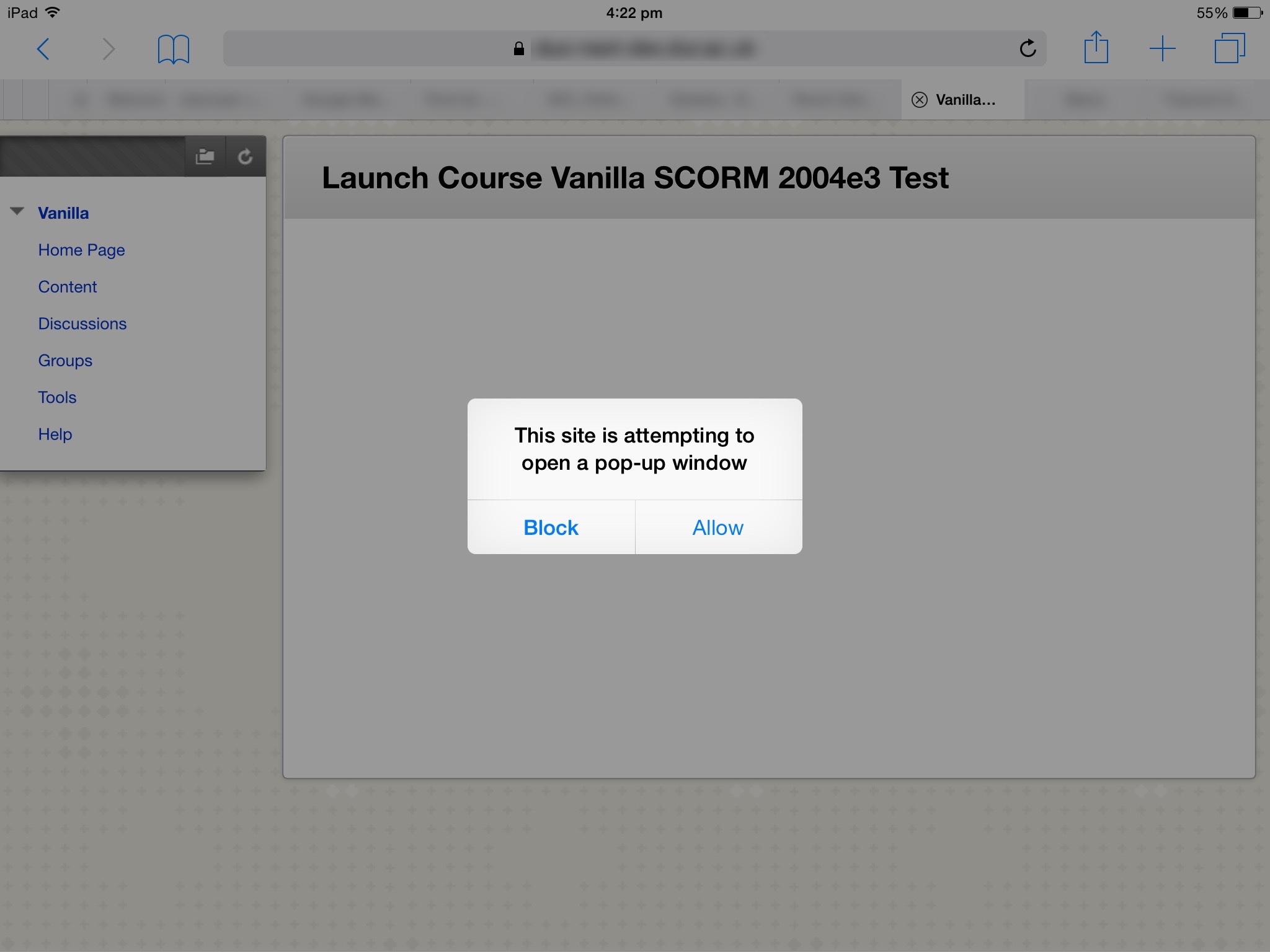
After clicking Allow the content launched as before, showing the same special Captivate mobile screen:
When the content is displayed, it is laid out respecting the orientation of the device:
and if turned:
Thus, with a bit of persistence, it is possible to play SCORM content using a browser on a tablet (or phone if you have a very high resolution screen and good eyesight).
Mobile App
The final tests used Blackboard’s Mobile Learn app.
The content is accessed by navigating a series of nested menus:
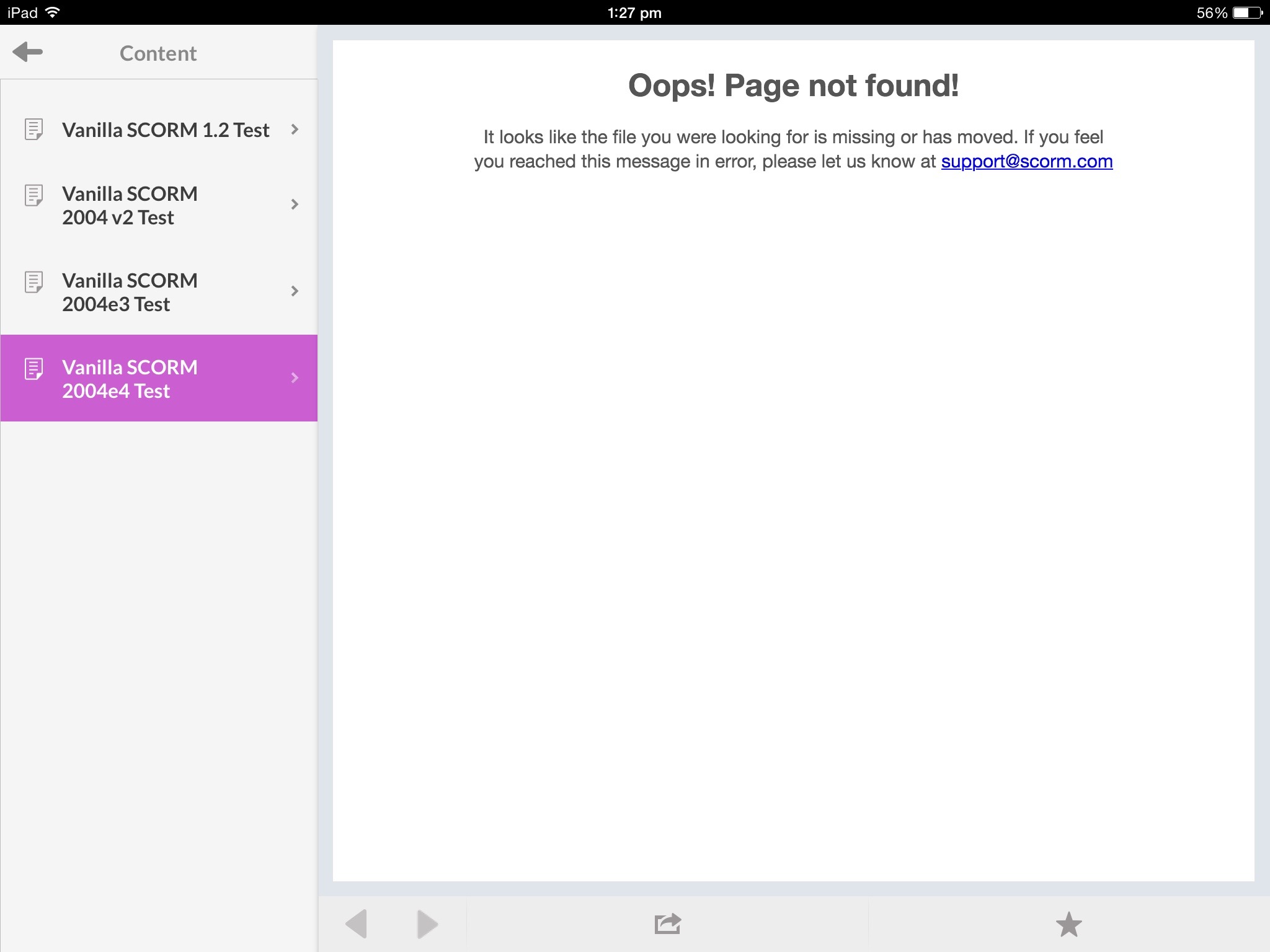
When you click on one of the links to the SCORM packages, the app does not know how to handle the content, so you are palmed off to the built in browser:

but eventually you get this
If I click the Launch Content button the result is again, not what I expected:
If you repeat this cycle and click fast enough, you can end up at this page:
I also tried updating the launch settings in Blackboard to do everything I could to avoid the popup:
Result: still no luck with the Mobile App.
As such I have to flag SCORM content as incompatible with Blackboard’s Mobile Learn app at present.