Tag Archives: Blackboard

Stand and Deliver

For attendees at BbWorld this year, the question on everyone’s lips was “have Blackboard finally released a version of Ultra that we can use?”  Most left with the answer “no” but seemed relatively satisfied. Things are complicated.

The term “Ultra” has become overused, a muddle that is entirely of Blackboard’s own making.  (For more details see this attempt by Blackboard’s Lynn Zingraff to shed light on the terminology and the company’s progress delivering it).

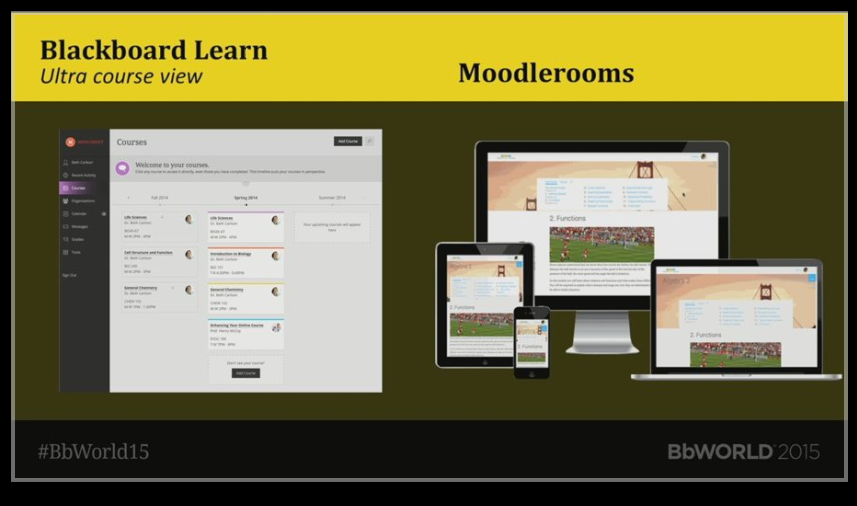
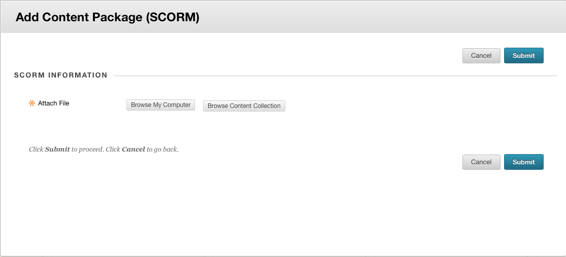
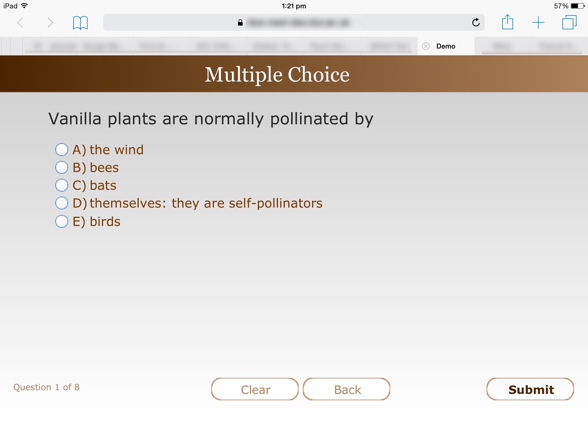
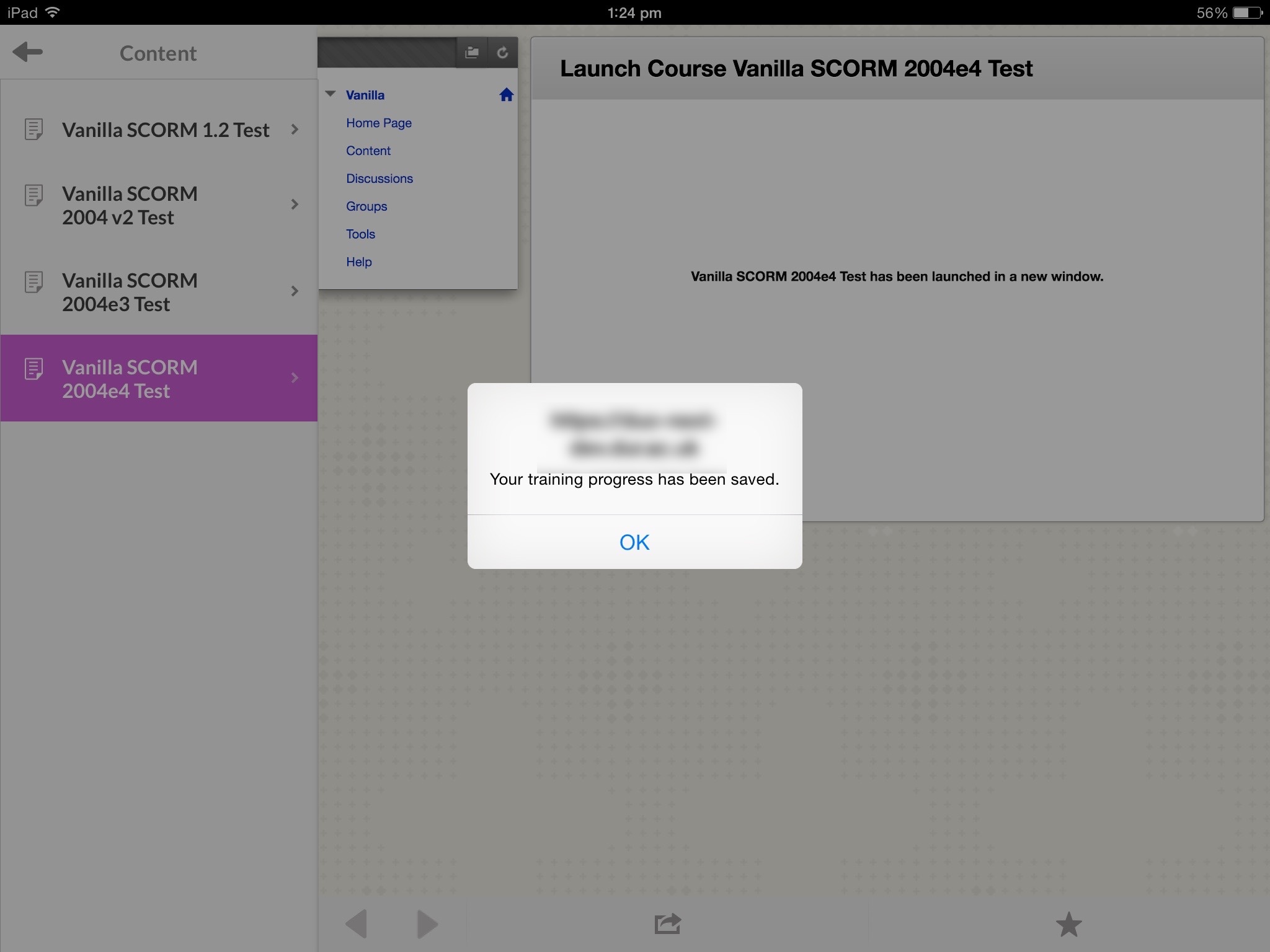
From my perspective, in its purest form “Ultra” applies to a re-vamped version of Blackboard Learn running in the SaaS environment on a postgres back-end, featuring a new responsive interface that adopts Blackboard’s New School design language (more on that in a minute). This new product is being trialled by a few schools but for most existing customers it still lacks many of the key features they need (such as comprehensive testing, group functionality, SCORM support, choice of language). As such few deem it ready for use in the production environment.

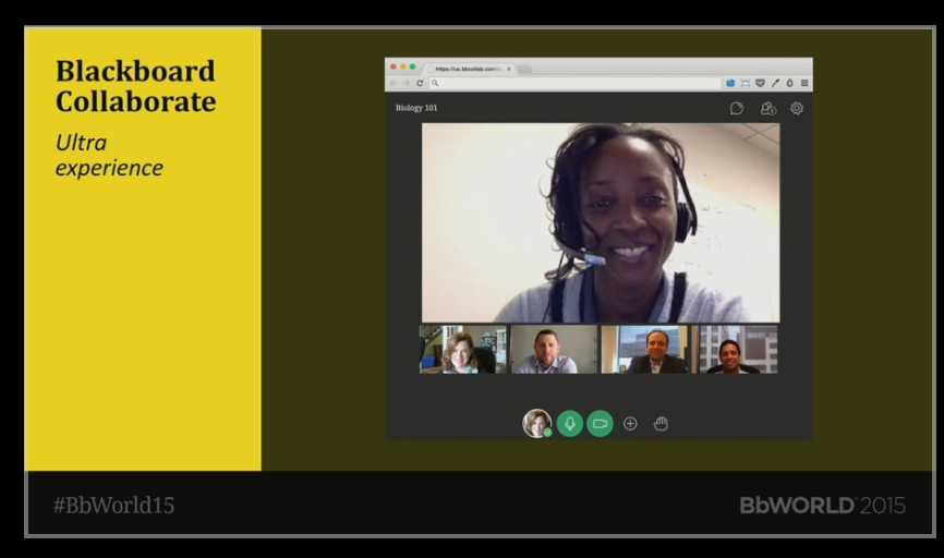
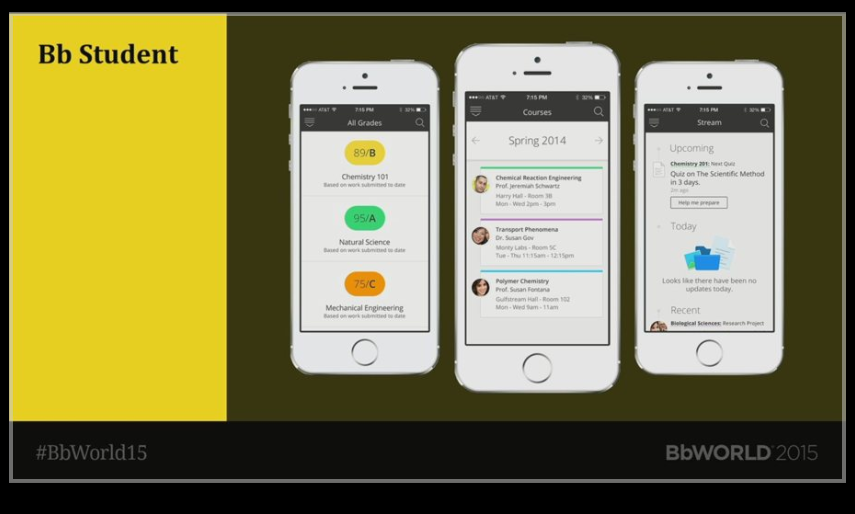
Where things get confusing is that perhaps in an attempt to appease those waiting, Blackboard talk about the “Ultra experience” when referring to existing components that adopt the same New School design. This includes the current Bb Student mobile app, plus some new ones coming soon (Bb Instructor, Bb Predict and Bb Planner amongst them). New School is also at the heart of the redesigned and much-improved Collaborate tool (see below).

Old School

Literally a couple of days before BbWorld, Blackboard released an initial responsive theme for the existing Blackboard Learn 9.1 product – allowing them to claim that they were now bringing Ultra to 9.1 clients – albeit only those customers running the latest version  (April/Q2 2016).

I’m going to provide a full review in my next blog post. From my initial testing, it is clearly not the real Ultra experience – being responsive alone does not make this New School. There are some usability issues (colleagues from Keele thought that users might have difficulty restoring a course menu once minimised) but I remain generally positive. Overall, it is definitely a better experience for people accessing the traditional Learn product using the phone  or tablet’s native browser.

It is worth noting that this theme is best considered a work in progress – Blackboard have already indicated that they plan further improvements in this area for the Q4/October 2016 release. This is something that clients have been demanding for a long time – to the point that one – Bert Coenen from KU Leuven – had gone as far as building a proof of concept responsive theme in 2013 (see the OSCELOT projects site).

One Learn is Enough for All of Us

Blackboard 1,2,3
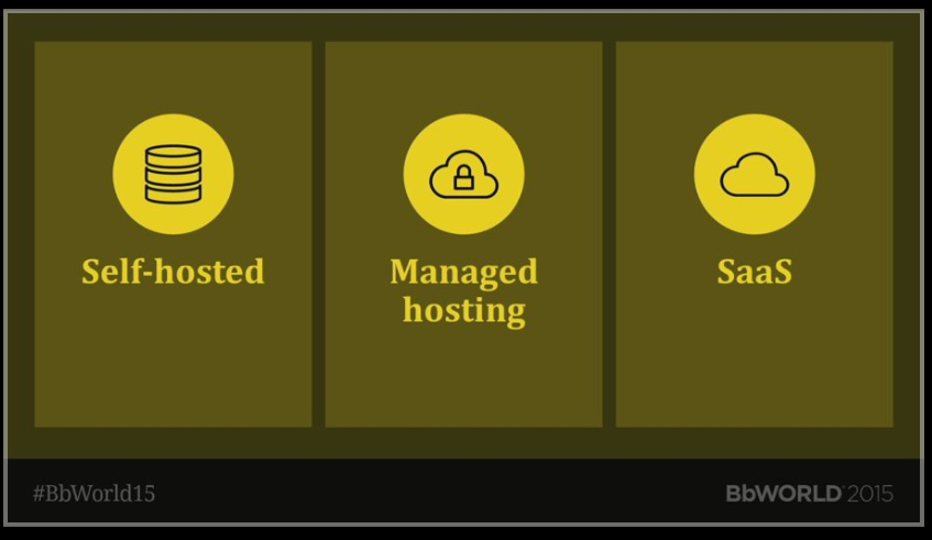
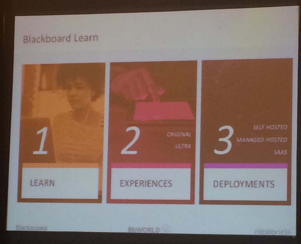
In the keynote and subsequent road map presentations, Blackboard staff talked a lot about “1,2,3” – that’s one Blackboard Learn, two experiences (original and Ultra) and three deployment options (self-hosted, managed-hosted and SaaS). I’m not sure that we have got to “one Learn” yet – Blackboard still seems to be supporting a ridiculously broad portfolio of solutions, versions and environments. They were very clear that they were not announcing the death of 9.1 – they remain committed to the product and its development.

Given this failure to really deliver “Ultra for all”, you could be forgiven for assuming that the senior management were berated by users. That wasn’t the case. The reason for this, I think, is the new CEO – Bill Ballhaus. He has a very different presence to his predecessors – none of the swagger of Michael Chasen, none of the “trust me I am/was a teacher” of Jay Bhatt. There may have been less passion in the BbWorld keynote this year, but there was a greater air of professionalism. People are willing him and the company to deliver. Bill stressed his background in engineering – a focus on quality and planning were essential to get something into space. He wanted to bring that same approach and focus to Blackboard. He understood what Blackboard was about – producing software that would help students succeed. It made a refreshing change from the arrogance of previous mission statements: “to continually reimagine education for a new generation of learners and teachers”. It’s not on the same scale as Shuttle failures, but the recent hosting problems experienced by UC Davis with their Sakai system reminded many just how business-critical these systems are to higher education.

Design Thinking

Another common feature of Blackboard’s presentation was the use of little vignettes, seeing a problem from the perspective of one or more people. This was often done with a sense of fun – learning about ‘Jack and Diane’ (any John Mellencamp fans out there?) or from ‘Bert and Ernie’ (a tribute to Sesame Street) during the Mobile Roadmap.

Why? Well it is evidence of Blackboard’s increased use of the design thinking paradigm. This video (shared by Eric Kunnen) explains IBM’s take on design thinking – made even more relevant given the strong IBM presence at the conference following Blackboard’s (US) web-hosting partnership with both big blue and AWS.

In short IBM see the design thinking process as understand people’s needs; exploring solutions to meet those needs; prototyping solutions and evaluating the results. As such it shares many traits of agile development. The key is to spend time talking to people to understand their needs, identifying the key “pain points” in existing solutions.

Persona-based Apps

What does this person say, think, feel do?
What does this person say, think, feel, do?

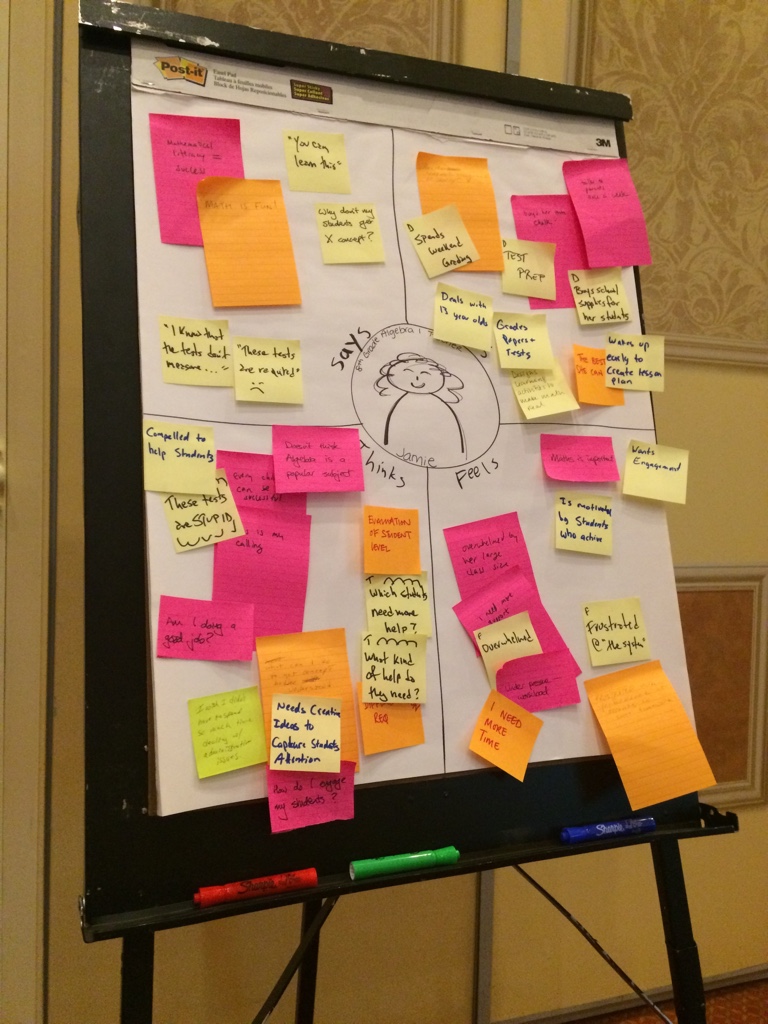
The design thinking outputs from all Blackboard’s empathy mapping and creativity is a series of persona based applications. ‘Jack’ the time-strapped student may use Bb Student, whilst on the go lecturer ‘Diane’ will use Bb Instructor to run webinars even when away from her desk.

Whilst admiral at many levels, such an approach risks technological determinism, or at least a belief that things must be changing ergo we need a technological solution. I wonder just how universally applicable this approach is: I wouldn’t just talk to the inmates if I was going to design a prison! Less glibly, can this approach differentiate between the students needs and wants? Will it help deliver a better education, or just add to the existing consumerism?

Key Insight
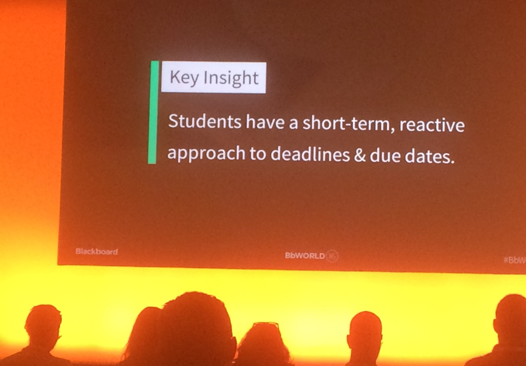
At the conference one “key insight” from Blackboard’s conversations with students  was shared. “Students have a short-term, reactive approach to deadlines & due dates.” This attracted derision from some delegates “tell me something I don’t know” and worried me.

Items flagged as important and today
Learn more about this on the Bb Blog – image from that site

The design solution offered – the activity stream – comes from Blackboard’s “fluid, intuitive, fun-loving”*  New School design language.  The question is, by placing this stream first and foremost when you open the Bb Student app or a course on Ultra (SaaS) are we not engineering dependency, reinforcing an ineffective approach, rather than trying to solve the underlying issue – be it that staff need to communicate deadlines more clearly, or that students need to develop better time management skills?

*Their words

Whose app is it anyway?

When describing New School, Blackboard staff stress the value of the aesthetic. They see their task as “To help shift the overall gestalt of educational software, from enterprise features to emotionally supportive solutions.” This quote shows what difference they think this will make:

“The traditional way of building software focused on requirements, driven by a competitive view of the market, and responded to perceived needs with additional features and functions. Our new way of developing products focuses on people first: on spending lots of time with them in order to build an almost intuitive sense for their emotional journey. We design with that journey and those emotions in mind, and as a result, we can product great products that people love.”

Jon Kolko
http://blog.blackboard.com/understanding-product-design-strategy-ecosystem/

I am pleased to see that so much thought and planning has gone into the appearance and user experience of the new tools. I think it is paying off as we can see the emergence of a consistent “Blackboard” user experience. One question I have is who are students and staff thinking of when they interact with Bb Student or Blackboard Learn? Is it the software vendor or the institution who chose it? Who should it reflect?

I also sign up (at least in part) to the “less is more” mantra. The current version of Learn contains lots of clutter and developmental dead-ends (e.g. the un-loved Tasks feature) and I would happily see these removed. There is a limit to this action though – minimalists take note, you still need a functional product that meets your basic needs. An example of a gap only recently filled is the ability to access discussion boards via the Bb Student app – only added in June 2016. It had always puzzled me why it had taken so long to implement this common feature. It turns out that Blackboard were wrestling with how to display nested discussions with comments on a mobile device (a fight that escaped the launch of Mobile Learn which has supported them for ages). Admittedly displaying multiple nested lists quickly eats into the space available to display the message. The answer is only to display one level of nesting and add an icon for comments. Sounds sensible, but why did it take so long?

Down the line

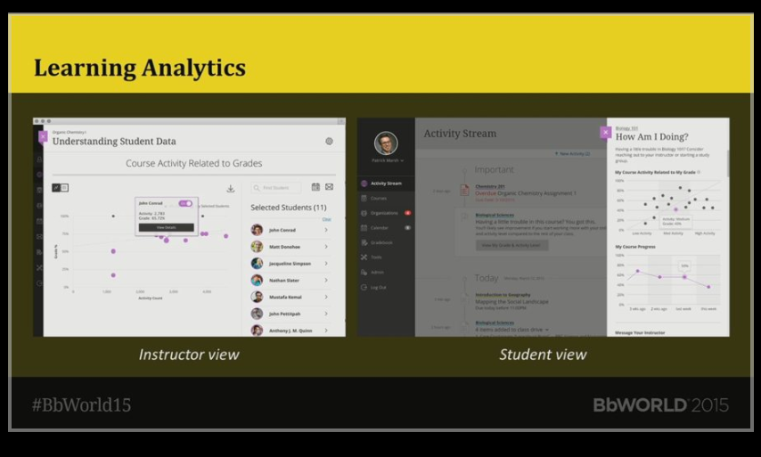
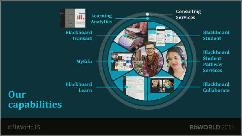
There were a number of other new or improved products discussed at BbWorld. Analytics for Learn (henceforth to be known as Intelligence for Learn) showed some promise – John Whitmer spoke animatedly about it’s potential.  I was probably most impressed with the changes planned for Blackboard Collaborate. Here at least we are seeing Blackboard thinking like a company that understands the needs of educators. On the very near roadmap are indicators of the progress of file uploads. So after uploading your presentation into Collaborate, you can see if everyone has air least got slide 1 displayed on their screen before you start talking. There are thoughtful inclusivity features – the ability to live caption and provide a locked video feed showing people signing. Linking back to analytics there is also discussions about ways to measure the effect of webinars on students –  recording user metrics and possibly a real-time engagement score. If they can get this right then they establish a clear lead over generic messaging apps such as Skype and Google Hangouts.

Bb Instructor

This is the next persona-based app, filling in the current gap in offerings for staff (Bb Student currently only shows courses where you are enrolled as Students) though I was promised that this may change and that there may even finally be a presence on Bb Student for a course’s shameful sibling – the organisation.

Bb Instructor is aimed at the tablet format and combines the existing marking functions released in Bb Grader supplemented by a new mobile interface for Collaborate exposes Moderator functions. Later releases should add more course planning and class management features, finally exposing some Edit functionality!

Bb Planner

An official Bb Tweet about Bb Planner

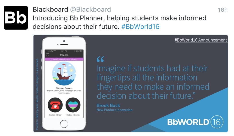
This product according to the marketing speak displayed at the conference is all about “empowering students to take control of their educational journey”. Blackboard seem to be taking what they have learned from users of MyEdu and their own Bb Labs Job Genie product and combined them in this tool.  Bb Planner prompts students to identify their goals and interests then based on these it suggests relevant programmes of study and careers. In the demo I saw, students were shown the likely salary and current demand for their chosen career, the training requirements and relevance of the courses that they had completed to date. They were able to select suitable courses at the institution and enrol upon them! The app uses data from external sources – jobs from Burning Glass and videos where people reflect on their careers from Roadtrip Nation.

Blackboard are not planning to release this tool in the UK as yet. In truth it will need more work before it can be widely used across the US. Development to date has been with one institution – Northeast Wisconsin Technical College – leaving many pundits asking how transferable/representative their processes are to others? I also wonder what the user experience will be when the app tries connecting to the student record and timetabling systems of large institutions? I think the response times might be greater than we saw in the demo! It is an admirable aim to avoid the confusion and queuing associated with such choices, but I am not sure where this sites with regard to institutional priorities.  If course/programme selection is only a hot issue for a couple of days at the start of each academic year – how much will institutions be willing to invest in time and money to fix it?

More information about BbPlanner is available at http://www.blackboard.com/sites/bbplanner

Blackboard Advise

The first thing to note is that this product is not called “Bb Advise“. I think that’s because it is not a mobile app, so is given the full company name. This tool is aimed at staff and designed to help them understand students’ goals, interests and aspirations – helping to inform face to face contact. Blackboard also see it playing a role supporting academic and career planning and also on the pastoral side, with dashboards designed to help staff spot and contact at-risk students. We weren’t given a demo of this – just a few screenshots.

Blackboard Predict

Dashboard screen shown on a laptop
Learn more about this on the Bb website – image from there

This tool is based on the predictive technology developed by Mike Sharkey and colleagues at his startup Blue Canary which Blackboard acquired. From the name you can surmise that it is not designed for use on a small mobile device. It comes in three parts: first the predictive model that uses an institution’s existing data to define measures that can identify students at risk; It then displays these data on a series of dashboards targeted at students, lecturers, and advisors; Finally it provides a communication tool to allow teaching staff to pass on potential alerts to colleagues in counselling and other professional support services, to deal with any problems early on. I don’t think this is targeted for release outside the US in the immediate future.

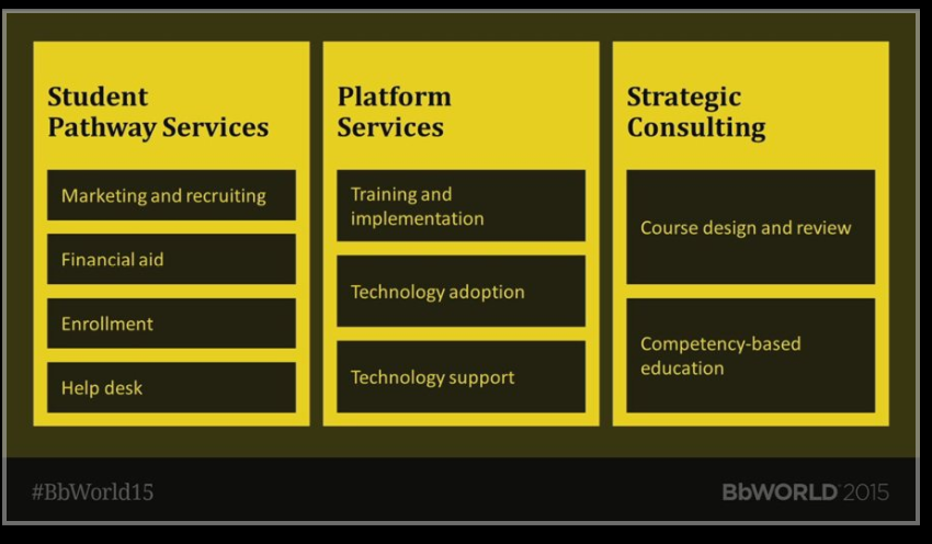
Supporting student success

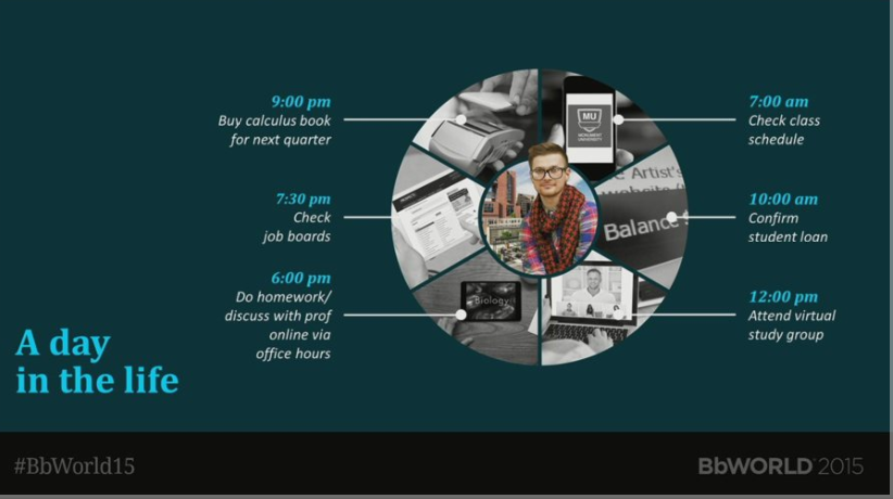
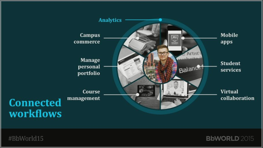
Blackboard appear keen to position themselves beside the student throughout their learning journey – selecting courses, managing their finances, choosing careers as well as the traditional learning and teaching activity. This raises more questions than answer: Will they be welcomed? Will institutions want to have so many of their core processes depending on a single supplier? How will others players in this arena react?  How will this attempt at standardisation fit with the various existing frameworks and bureaucratic processes?

As a company their products seem to sit better together, offering a more joined up experience. I think thats why so many Blackboard staff look happier this year than they have for the previous few. I think that’s a very good sign as they employ some very clever people. Hopefully we have seen the end of “lab” projects that rely on Facebook authorisation when institutions already have their own established perfectly good authentication and authorisation solutions.

I think Blackboard can look back on BbWorld16 as a success, but should note that the pressure to deliver a true Ultra experience for Learn has only intensified.  In July 2017 the audience in New Orleans will be expecting more than just a responsive-ish theme to take back home. Will Bill be able to deliver again?


Advertisement

REST and be thankful

This post’s title is a tribute to the highest point on a road in Scotland, where weary travellers would pause for breath (see this site). Today I am reflecting on the long journey that Blackboard has taken in its use of APIs and interface hooks and what the release of the new REST API means for developers.

One of the strengths of Blackboard’s Learn product has been the fact that developers could extend it using Blackboard’s Java APIs. This has led to a host of third party tools (including many free, open source solutions)  which add new functionality or address gaps in the interface (see the building blocks catalogue and the OSCELOT projects site). This has not been the easiest space to work in – despite repeated requests, many of the APIs remain undocumented or flagged as private – even though there is no other way to achieve the outcomes. Worse, the underlying data model suffers from an early decision to separate functions exposed in the user interface, from more administrative features (such as managing users, courses and enrolment records via a feed a student record system). This means that there are actually two classes representing most actors – e.g. blackboard.data.user.User and blackboard.admin.data.user.Person. The associated loaders use different parameters making the whole process more complicated/tedious than it needs to be. Extensions using these APIs and the associated tag libraries result in a tightly integrated solution that looks and feels just like the rest of Blackboard. That’s good, but as the code runs on the Blackboard server, there is a risk attached. As we see Blackboard’s preferred architecture moving from a self-hosted model to the cloud (in some cases adopting a multi-tenancy approach) then the ability to alter the core code becomes less attractive to the vendor.

Blackboard’s second foray into this area was to expose a series of SOAP web services. Whilst used by some clients, they are clunky and not popular with developers. They too suffer from incomplete documentation. Indeed they are so tardy that one developer (Andrew Martin from Newcastle) actually wrote alternative SOAP and REST frameworks, earning a Blackboard Developer’s Award in 2008.

Fast forward to 2016 and Blackboard finally unveiled their long-awaited REST APIs. Or at least the first few (see https://developer.blackboard.com/portal/displayApi). Initial impressions are good. They are using Swagger to document them, making it much easier to get started. They have also given a lot of thought to the end points with GET(get), POST (create), PATCH (update) and DELETE (delete) methods used consistently. As a slight aside, Blackboard are working on a similar set of REST APIs for their Collaborate product. That’s great but it looks like they were developed without talking to the Learn folks as they use slightly different method names (e.g. PUT rather than PATCH). Hopefully that discrepancy can be resolved before they are made public.

Calls use an OAuth token to authenticate. Each web application requires a unique key and secret, which the developer registers via Blackboard’s new Developer portal and then a Blackboard sys admin registers on their system. In this first implementation each app just has one key, I think it is likely that in later iterations it will be possible for developers to generate a unique key for each institution that chooses to deploy the app, allowing greater granularity of access control and reducing the risk of a man in the middle attack.

Blackboard’s Scott Hurrey and Mark O’Neil were both very keen for attendees to use the new API. To help, they have developed a series of examples on GitHub in a range of languages, including Python, Java, C Sharp and Ruby. The REST API is now included in the latest Blackboard Learn release (2016 Q2 – albeit flagged as ‘technical preview’) and in their Vagrant-based Developer Virtual Machine.

What does the mean for developers? The REST examples released to date are all external tools – designed to pull data from Blackboard Learn, possibly manipulating it and then pushing it back. This seems to be part of a co-ordinated move to “encourage” third party code to stay off the core Blackboard servers. Whilst sensible enough for commercial integrations, this is not such good news for in-house solutions or people developing extensions designed to run completely within Blackboard.

The new Blackboard Ultra lacks many of the extension points/hooks available to developers in previous versions of Learn (e.g. it won’t let you define new course control panel tools). There was one session suggesting that you could craft special LTI links using template variables and custom parameters which point at a building block to get round this  (LTI is still supported in Ultra) but this is at best a kludge. Even uploading code as a building block will require assistance from Blackboard.

In summary there is a lot to be thankful for if a set of REST APIs will meet your needs. These appear better thought out and better documented than ever before. If however your needs can only be met by code running Blackboard server-side, then things might get trickier in the future. It seems flexibility is being sacrificed for stability and security. Only time will tell how wise a move this is.

New Blackboard, New Labour, Old Rope

The “new” moniker so beloved of Labour in the Tony Blair era has made a reappearance, this time at BbWorld 2015 in Washington DC. It came this time from Jay Bhatt, the latest President and CEO of Blackboard. We are now given “New Blackboard”:

the new blackboard

Not content with that, he’s also giving us NLE – the “New Learning Experience”. (Wisely avoiding the XP option).
So what’s it all about? Well Jay Bhatt has identified five key areas:

NLE

Intriguingly, and almost as an afterthought in his keynote he stressed that integrated workflows might be the most important of these. Really? He talked passionately about the work that Blackboard have been doing, re-engineering their entire portfolio from the ground up (though that isn’t news, the same has been said in Vegas, and in Vegas before that).

There was also a strong attempt to show that Blackboard is putting the learner centre stage, with enormous pictures of children dwarfing the presenter on stage:

Handy to be able to use your family for these occasions

So what was new then? How will all this investment in technology help improve education? Jay is calling for a revolution, claiming that Education is in cris. Re-imagine Education everyone. So let’s see what he’s offering…

Learn

vles 2

We were shown Blackboard Learn sporting the new Ultra interface. Again. Yes it is still pretty. Learn finally looks like it is using code that was written after 2010. But does it surface or bury the information learners need? I worry that it is offering content without context in the stream of new items and latest posts. Where has the scaffolding and advice from staff gone? If the underlying data model and database structure hasn’t changed, is it more than lipstick on a (very fat) pig? Time will tell. Oh and they will still host Moodle for you too.

Collaborate?

The Ultra interface
The Ultra interface

Not exactly new. This HTML5 video experience has been showcased at the previous two BbWorlds and yet still hasn’t achieved feature parity with the old java version – no recording yet, no integration with Blackboard (ironic given the later claims of integration being the key).

Flexible Deployment
flexible deployment

Again, how is this new? This was basically a repeat of what was said the previous year. In fact this presentation seemed to cause more confusion than light, with many commentators on Twitter wondering just when the much vaunted “Ultra” interface (that is to premier in the SAS offering) will filter down to self-hosted clients, indeed if it will make it at all.

Bb Student

mobile

The app discussed last year is now available to some people. New?

Service Capabilities

service capabilities

You want it? Blackboard will provide it for you, at a keen price. Is this news?

Technical Backbone

tech backbone

Essentially joining things up, Blackboard have been threatening to do this for years. One day they might actually manage it, but anyone whose looked at the admin interface of the current Collaborate product will know that there is still some way to go on this. Too many of the products lack parity – no analytics data from Blackboard Mobile being an obvious example. This is an admirable aim. As it was in Las Vegas in 2013. That doesn’t make it news.

Learning Analytics

learning analytics

This was probably his strongest card. Providing integrated analytical data for all staff and students could help us to understand more about the way we learn. Sadly this is likely to be an optional extra, rather than a core offering available to all Blackboard clients.

He looked at the learner’s experience, stressing the life long nature of learning. Most relevant to me was the example of a higher education student:

A day in the life of a HE student
A day in the life of a HE student. Shout if you spot lectures, practicals, tutorials, in fact any significant period of study!

We were then shown the workflows:

HE workflows

and guess what, Blackboard has solutions for all of these:

HE software

News? I don’t think so.

There were a lot of promises and repackaging of things already delivered. Perhaps my initial political analogy wasn’t so far off the mark after all. Come on Blackboard! There are a lot of bright, motivated people in the company, many of whom have spent time in education. You can do better and will need to do better if you are to deliver products that staff and students want to use and institutions are prepared to buy.

The many flavours of SCORM

This post documents my investigation into getting SCORM packaged content to play in Blackboard and looking at what we can learn about the learner’s interactions via the Grade Centre.

There is often a need for a simple way to insert learning materials created outside the LMS (Blackboard, Moodle, Sakai, etc.) into it. These could be materials produced by a third party – perhaps supporting a published text book, or a custom training course. It is at this point that people usually start talking about SCORM.

What is SCORM?

SCORM (the Sharable Content Object Reference Model) although not a standard (sensu IMS, etc.) is the nearest thing there is to one. Whilst newer formats such as Tin Can (also called the Experience API) offer more possibilities, at the time of writing very few LMS vendors have implemented these sufficiently to make them any more functional than the latest flavours of SCORM. The list of Tin Can adopters published by Rustici is impressive, but may perhaps be best seen at present as a list of those working to implement it fully (see for example these posts regarding Sakai, Blackboard and Moodle). Apologies in advance if there are more recent developments that I am not aware of!

The trouble with SCORM is that it is not a single thing. In fact it is a wrapper around a series of existing formats, and you can meet this reference model in several different ways. Most people using SCORM today use one of these “flavours”:

  1. SCORM 1.2
  2. SCORM 2004 – which is available in 4 editions, edition 4 (2009) being the latest.

Rustici have published a very useful set of SCORM resources. In this post I am going to test some custom content created in Adobe Captivate and export it using a range of SCORM flavours, importing the resulting file into Blackboard. I will then look at the reporting options available and how these measure up to those for a standard test/quiz. Technical Information

  • Adobe Captivate 8.0.2.266 running on a MacBook Pro with OS X Yosemite
  • Blackboard Learn 9.1 October 2014 release (CU2)
  • Building Block: Rustici SCORM Engine 2013.4.1164954*

* Blackboard released a new version of this Building Block as I was part way through these tests. I have learnt the hard way not to apply these too quickly.

The Content

I created a simple object (which I called Vanilla) which uses a range of different question types. Some of these are drawn from pools, some are hard-coded into the object. In any run through, the user will be asked to answer eight questions, each worth 10 points:

  1. Multi-choice (single answer) question – 1 drawn at random from a pool of three questions
  2. True/False question
  3. Fill in the blanks question
  4. Matching question (three heads to three tails)
  5. Image hotspot question
  6. Ordering question (arrange the 7 steps of a process in the correct order)
  7. Multi-choice (single answer) question – 1 drawn at random from a pool of three questions
  8. As 7, with a different question drawn from the same pool.
Creating the Quiz in Captivate

Scoring Options

Before exporting anything, you need to define how a person passes the test. This is defined in the project Preferences. File | Project Info and then click on the Pass or Fail option down the LHS:

Scoring Options
Scoring Options

You can see here that we have set the pass rate to be 80% (pretty high). There is also the option to choose a numerical score as the threshold. The other options (relating to what happens if you fail and the ability to retake the quiz can be ignored for the purposes of this test). The next step – deciding what to report back differs depending on the SCORM flavour you use…

Export Options

A SCORM object can report (to the LMS, usually via the Grade Centre or equivalent) different measures, depending both on the SCORM flavour you use and the way you set it up. Typical fields it can report are:

  • The Completion status (how many of the pages of content you actually viewed). When a SCORM course is launched, the status changes to Incomplete. It changes to Complete when the user meets certain criteria – the Completion Criteria.
  • The Score of any quizzes taken
  • The score and/or the completion status can also be used to derive a Pass/Fail flag
  • Ideally, you also want it to provide details of the Interaction – how long people spent on each page, which questions they attempted (remember these may be drawn at random from a poll) and the answers they provided.

In the simplest case, the Completion Criteria might be just that the user has launched the package. It is more commonly defined as either viewing a certain number/percentage of slides and/or achieving a pass score in the quiz. In order to export content as SCORM you need to adjust the project Preferences. File | Project Info and then click on the Reporting option down the LHS:

SCORM 1.2

If you select SCORM 1.2 under the Standard select control the rest of the page looks like this:

Configured as per suggestions
SCORM 1.2 settings Configured as per suggestions

You can see that you can choose to simply report that a user’s interaction with the object is complete or incomplete, or go for the slightly more nuanced incomplete/fail/pass. In the second step – Success/Completion Criteria you can define whether you want to define a Pass in terms of User Access (either simply a percentage of slides viewed and/or passing the quiz). If you click the Configure button, you can see the values that will be written into the SCORM manifest file (these values are used when you deploy the content into the LMS):

configure scorm1.2 Note that you only have the option to export the 3rd Edition flavour of SCORM 1.2 in Captivate. It also only supports a single SCO (Sharable Content Object) within a project (actually the entire project), even though SCORM itself allows several. This restricts the reporting options, although in most cases a single SCO is adequate. The default Advanced settings are used in these tests:

Advanced settings
If in doubt leave these as they are

SCORM 2004

If we select SCORM 2004 under the Standard, the page changes slightly: prefs The Status Representation options seen in SCORM 1.2 disappears and instead we have the option to define separate Completion and Success criteria. This allows for the same level of reporting as the earlier incomplete/fail/pass option: incomplete = Completion criteria not met, Success criteria not met; fail = Completion criteria met but Success criteria not met; pass = both Completion and Success criteria met. You can define both criteria using test scores, number of slides viewed or just opening the package. In my case I have opted to define completion as viewing a certain number of slides and success as passing the test. Again there is the option to report the Interaction Data. If you click Configure, the dialogue displayed is similar to SCORM 1.2 but not that the user has the option to select their preferred version of SCORM 2004 – one of the 2nd, 3rd and 4th edition.

configure

I chose to use the latest one. We left the Advanced settings at defaults (as with SCORM 1.2). For testing I published three SCORM 2004 versions, one for each edition available in Adobe Captivate.

Publishing the Content as a Zip File

Regardless of SCORM flavour, the process of publishing the content is the same: File | Publish…

You can see that this file will be deployed as HTML rather than a SWF
You can see that this file will be deployed as HTML rather than a SWF. The chosen SCORM flavour is shown at the bottom right.

Note that the option to Zip Files is ticked. In summary, at the end of the tests I had four SCORM packages:

  • SCORM 1.2 3rd Edition
  • SCORM 2004 2nd Edition
  • SCORM 2004 3rd Edition
  • SCORM 2004 4th Edition

Deployment Options

The content was added to a new Blackboard course as a Content Package (SCORM) – this is the custom content type defined by Rustici’s building block:

Adding the SCORM package

You are prompted for the location of the zip file you published:

Click Browse My Computer to locate the ZIP file
Click ‘Browse My Computer’ to locate the ZIP file

after selecting the file, I clicked Submit to upload it to Blackboard where the manifest file is parsed. The first part of the form reads the descriptors from the manifest and asks you to confirm the details displayed to students: add step1

Note the fact that the Title and Description values are taken from the manifest using the values you typed into the Configure box above. The second section determines how users can interact. After thanking the developer for selecting “No” as the default option for Make SCORM Available (can never get enough radio button clicks) then it’s down to the attempts. For these tests I am going to allow an unlimited number, without any date restrictions. There is no sense in turning tracking on as you will get much better data from the SCORM object itself when you open the Grade Centre. add step2

The third section is where you define the integration with the Grade Centre (unless you choose the option No Grading). Note that even if the content doesn’t have a quiz baked into it,  you could set a simple score related to completion that would indicate the people who had worked through it. Blackboard users note, the Title setting here is what is used to name the Grade Centre column. Given the multiple flavours of SCORM that I am testing, I will have to be careful here and use one of these names each time:

  • v1.2
  • v2004e2
  • v2004e3
  • v2004e4

Keeping them short is a vain attempt to reduce the scrolling in the Grade Centre. I’m selecting to use the SCORM Score as the Grade, so I will see how well people have done in the quiz. The Grade SCOS (which should read Grade SCOs) section can be left at No as this captivate content can only ever have one shareable content object, so there is no need to provide separate scores for each part. I am leaving Grade Timing at showing the Grade of Last SCORM Attempt (though you can get them all via the Grade History). Screen Shot 2015-07-20 at 14.31.05

Finally clicking the Submit button creates an entry in Blackboard

Screen Shot 2015-07-21 at 16.28.35

When you click the link, the chances are out the box it will not behave as you wish. In my case, it opens as a new popup window that is not quite the right size:

Opening in a pop-up
Opening in a pop-up – note the scroll bars 😦

To sort this, you need to edit the content again in Blackboard and make use of a feature that only appears after initially submitting it and does not conform to the Blackboard UI style manual (oh yes there is one!) Below the SCORM AVAILABILITY entry there is now a new entry ADVANCED OPTIONS:

Screen Shot 2015-07-21 at 16.32.36

If you change the radio button to Yes, a whole heap of extra options are displayed

The first set relate to the Navigation Controls – these can be important if you want to show/hide the course structure down the left hand side, or display a Close button at the top of the screen:

Screen Shot 2015-07-21 at 16.34.05

Clicking any go the other text below the radio button, e.g. Launch Behaviour gives you more options.
This is where you can set the size of the opening window. The page helpfully highlights any changes in a pretty shade of rose pink:

Screen Shot 2015-07-21 at 16.45.58

That’s it sorted now.

I then repeated the process for the three SCORM 2004 flavours.
Note that as far as configuration within Blackboard goes, in this case the same settings can be applied to all four flavours.

Note, later I explored these settings in more detail. I came across a variable that sets the SCORM edition under Compatibility Settings:

How important is this?

I was not impressed that this was not set correctly by default for the SCORM 2004 items – it seems to default to the 2nd Edition 😦
On the up side, changing this did not seem to make any difference to the content item’s behaviour.
The SCORM 1.2 did not have this setting, so at least it detected that correctly!

Completing the Tests

I then logged in as a student and completed the four SCORM objects. You could not tell the difference from the user perspective.

I will come back and look at the experience using a range of devices (laptop browser, mobile browser and mobile app).

Logging back in as an instructor, I can see the entries for each SCORM item in the Grade Centre:

Screen Shot 2015-07-22 at 11.11.21

To see the detail of any given attempt, you have to select it using the context menu at the right hand side of the entry:

see an attempt

To cut to the chase, there is a difference in the data displayed from SCORM 1.2 and SCORM 2004 items, but no difference between the various SCORM 2004 flavours:

SCORM 1.2 2nd Edition
SCORM 1.2 3rd Edition
SCORM 2004 2nd Edition
SCORM 2004 3rd Edition
SCORM 2004 4th Edition

The key advantage of the SCORM 2004 format is that you see the text of the answer selected by the user, rather than just an identifier (e.g. a, b, etc.).

The utility of the response varies by question type. For text responses it is easy to see which response the learner chose and whether it was correct, but for some (e.g. hotspots, where just the co-ordinates are displayed) or ordering (where you need to parse (URLDecode) the entries selected) you need to pay much closer attention.

It is interesting to see how long a student spends on each question.

That’s about as good as it gets though. There is no overview available across all the students on the course, no ability to analyse the effectiveness (discriminatory power) of the individual questions.

Item Analysis

Compare the results above, with the sort of analysis that comes out the box for the much-derided Blackboard Quiz:

From the Control Panel in a Course:
Course Tools | Tests, Surveys and Pools | Tests
and from the context menu next to the corresponding Test choose Item Analysis

Item Analysis

Running the analysis can take some time (especially if the class contains a lot of students) but the results are worthwhile.

In the screenshots below I am displaying Item Analysis results for the same questions used in the SCORM package, but deployed as a Blackboard Test.

The Item Analysis starts with a summary of the test, how many people have taken it, and an indication of how individual questions score in terms of difficulty (the percentage of students who answered it correctly) and how discriminatory (the ability to discriminate between students who know the subject matter and those who don’t based on the response to this question) they are.

Screen Shot 2015-07-22 at 12.12.17


Below the table is a list showing the results for each question in detail. You can filter this, e.g. to show just the questions with a poor discrimination value:

poor questions


After applying several filters to get a feel for the data, you can drill into each question to see the statistics behind these measures:

fair questions


In this table we see columns of figures. The first shows the breakdown of responses across all learners. E.g. 3.87% of all the people who worked through this material thought (wrongly) that Vanilla translates as “Nectar of the gods”.

The remaining columns show the responses selected for four groups of learners, grouped by their final score. So we can see that none of the people whose final score placed them in the top 25% (Q1) chose the option “Nectar of the Gods’, whilst 15 of the people in the bottom 50-75% (Q3) selected it, and 6 of those in the lowest 25% (Q4) chose it. This information is very useful when you come to review the questions.

It would be great if this information was available from SCORM content too, but at least in the Blackboard implementation, this information is not available.

Recommendation

I think SCORM can be used to deploy custom content, to convey information, introduce new ideas and help students assimilate this information into their own mental model. If you are only interested in the final numerical result, then it makes sense to include a test within the SCORM content. SCORM 2004 provides better reporting than SCORM 1.2.

If, however, you want to be able to refine the questions and possibly tune the training materials based on repeated wrong answers, then I think at present it is better to decouple the quiz from the SCORM object and deploy it as a separate stand alone test (possibly only visible once the learner has completed the SCORM packaged content at least once). This also gives you more flexibility should you want students to retake the test later and possibly revisit the materials if they fail the test the second time.

Device-Dependent Display

I also wanted to test the way the content was deployed using a range of configurations. The Captivate project used a responsive template, so the content uses one of three defined layouts, with break points defined at display widths of 1024 pixels (desktop), 768 pixels (tablet) and 360 pixels (mobile):

Desktop Layout
Desktop Layout


Tablet layout
Tablet Layout


Mobile Layout
Mobile Layout

To test this I launched the course using a laptop and a tablet. I considered using  a mobile phone too, but I think this form factor is really too small for much e-learning content. For the laptop I wanted to see the effect of resizing the window. For the mobile devices, I wanted to see if it reacted to a change in orientation.

Standard Browser

The link appears as a normal content item:

No surprises here :-)
No surprises here 🙂

Clicking the link causes a new window to open. The SCORM content plays in this, filling the screen. The content of the window underneath is repainted to show that the SCORM player has launched in a new window.

laptop launch
It is also possible to display a title bar across the top and the table of contents down the LHS if you want – they are not appropriate for this content.

When you have worked through the materials and close the SCORM player (And so it’s window) , there is a short delay, then the remaining window is updated, returning you to the content items again.

I then tried resizing the popup window to see how the content layout responded.

When I started narrowing the window width, the content did resize to a layout more like the Tablet option set in Captivate:

The Start button doesn't look quite right
Some of the text has not flowed particularly elegantly, but it is all visible

When I continued to reduce the width, it eventually flipped to the Mobile layout:

Perhaps surprisingly, this factor appears better

As such, although with a few layout issues, the SCORM content is acting in a responsive manner when viewed on a desktop/laptop.

Mobile Browser

This test was carried out using an iPad, accessing Blackboard using the built in Safari browser:

Very similar to the laptop experience at present

Things didn’t quite go as expected when I clicked the link to open a SCORM item. Instead of a new window I got this:

Safari didn't like the popup window
Safari didn’t like the popup window

If I then clicked the Launch Course button the player is launched.
Unlike the desktop browser though, the opening screen is intercepted with this standard Captivate screen designed to provide help for mobile users:

The icon at the top right opens guidance for using gestures

If you click on the Gesture icon, these instructions are displayed:

Handy as they are not all immediately obvious

Click the screen again to dismiss this information, then click on the player icon to finally launch the content:

Launched in landcsape
Launched in landscape

If you rotate the tablet, the content is flows to (at least partially support) the portrait orientation:

After rotating the tablet
After rotating the tablet (note the larger Start button, because we are now below the 1024 pixel width setting)


When you have finished working through the content and close the SCORM object, you are returned to the course as before.

The popup blocker annoyed me, so I went to the Settings for the iPad and searched for the options for Safari. Sure enough there was a Block Pop-ups option:

There it is - Block Popus
I switched OFF this option, as shown here

With this set duly to OFF I tried launching the content again. I expected the file to open, but no, there was a further surprise. Now I was presented with a dialog box asking me to conform the popup.

A pleasant surprise
A pleasant surprise

After clicking Allow the content launched as before, showing the same special Captivate mobile screen:

The icon at the top right opens guidance for using gestures


When the content is displayed, it is laid out respecting the orientation of the device:

Landscape
Landscape

and if turned:

Portrait
Portrait – it has adapted to the narrower width, but not extended vertically.

Thus, with a bit of persistence, it is possible to play SCORM content using a browser on a tablet (or phone if you have a very high resolution screen and good eyesight).

Mobile App

The final tests used Blackboard’s Mobile Learn app.
The content is accessed by navigating a series of nested menus:

Ah the joy of magenta

When you click on one of the links to the SCORM packages, the app does not know how to handle the content, so you are palmed off to the built in browser:

There's often quite a wait at this point...
There’s often quite a wait at this point…

but eventually you get this

Pop goes that weasel
A familiar page – note that this browser has ignored my Safari settings to allow Pop-Ups

If I click the Launch Content button the result is again, not what I expected:

What
It seems the built in browser essentially closes the content on load, and so your SCORM session terminates abruptly.

If you repeat this cycle and click fast enough, you can end up at this page:

Would they really want an email from me?

I also tried updating the launch settings in Blackboard to do everything I could to avoid the popup:

No joy
No joy

Result: still no luck with the Mobile App.

As such I have to flag SCORM content as incompatible with Blackboard’s Mobile Learn app at present.

Not one for sitting on the fence

Today I was in Newcastle, lucky enough to attend the #audreytalk event in person –  thanks to Suzanne Hardy and Mike Cameron for the invitation. Audrey Watters – think Hacked Education, Educating Modern Learners and most importantly her own domain [read on] – had travelled north after her ALT-C keynote to challenge the assembled audience sitting in Newcastle University to think Beyond the VLE. I’ve long been a follower of her blogs and her challenging opinions (thus the post title) and it was a great chance to meet her in person. Her slides and notes are available here.

She began with an apology – about the US-centric nature of her writing. She then talked about ed-tech as a route for a new US cultural imperialism. (She didn’t use these words, but I think this process could offer an alternative, darker (re)definition of Euan’s Semple’s catchily named trojan mouse concept). She then had a kick at Blackboard, and another, and another, and also all the ed-tech startups/wanabees who think “Blackboard sucks” but then essentially want to create another, but skinned differently. To over-mix my metaphors, a Blackboard in Facebook/Coursera/any old sheep’s clothing still sucks, even if the potential market and spending record of schools and universities on such systems has investors drooling at the mouth. She was exceptionally critical of the lock-in of data and ideas that a VLE facilitates, fenced off from the outside world (nicely illustrated with slides of cows looking at you across barbed wire).

Yet this walled garden did not suddenly come about when institutions signed up in droves to buy VLEs. There have been fences around schools since at least Victorian times. The reasons for these remain complex – is it protection of identity, income, reputation? Is it thought to promote the rarefied atmosphere ‘required’ for learning – i.e. to keep others out?  iThis self-imposed fencing was explored further by questions from the audience – the internet is still being portrayed as something to be protected from – witness the 4 page acceptable internet-use agreement my 9 year old son son and I had to sign for at the start of his year 5* class at school earlier this month. It could be argued that we get the solutions we pay for, and these learning management focussed systems dovetailed neatly with the needs of institutional managers. Her point is though, that the learners and teachers had little say in this.

She talked about the danger of storing things in the cloud – witness the recent iCloud password hack ‘exposing’ [pun intended] celebrity photos – and stressed the importance of owning your own data. She then talked of a different approach taken by the University of Mary Washington – their Domain of One’s Own initiative – where students and staff are bought their own domain (whose name they can negotiate) and helped to set up LAMP tools such as a blog. An interesting idea and a very brave marketing strategy – note the equal number of dislikes as likes on their introductory video.  I’m guessing from the abandoned Bagman blog that this approach (be it marketting or DIY infrastructure) wasn’t to everyone’s taste. This hands on, take control of your data approach is one that resonates with Audrey.

It has a sense of coming full circle. It was reminiscent of the early web publishing activities of staff and students in the time before VLEs – Audreys uses her own graduate teaching at the University of Oregon in the late nineties as a case study. This was interesting and resonated with my own early teaching experience. I was also a member of what we could term ‘Generation tilde‘ – those who had public web space on their University’s servers, accessible by simply appending ~ and your username to the institution’s domain. We were certainly much freer to publish content than we are now, but I think we suffered from the lack of data about what people were doing on our pages and few had the skills to code online tests, discussion boards, let alone provide tools where students could begin to construct and challenge their understanding online together. The web was freer, but it was also a lonelier place then.

Reflecting on her talk as I travelled home, I couldn’t help feeling that she is on to something, that somehow we need to improve the base level of digital literacy in the population and heighten awareness of where our data is held and how valuable it is. I loved her quote “data is the new oil”. I also loved another version that Doug Belshaw had heard (apologies I remembered the quote but not the source) – “data is the new soil” – I think that neatly captures the fact that this the data are the beginning not the end-point. I am still wrestling with the inherent tension between the desire to be open and the need for private spaces to learn. I think it might be easier for professionals (e.g. teachers) to share materials and if possible the journey (including any wrong turns), all subject to continual refinement and reflection. Martin Weller and Gráinne Conole are a good examples of this from HE. Yet I think we also owe it to our students to provide them a ‘safe place to fail’ – somewhere to experiment, try different approaches and angles, without worrying that these actions will haunt them online through the rest of their life.  If we ask/require students to make their learning public, can we predict the effects? I am worried that such an approach may have a negative effect on learners with low self-esteem, the slower thinkers, those still struggling with the subject, or trying to consider things from an alternative perspective. Would it promote an attitude of playing safe, favouring the students who are first with the most obvious answer, reinforcing the actions of the loudest, or playing to the audience?  Yet how many people would really read students assignments? Shouldn’t I also draw hope from the fact that people seem to find the courage to post the most remarkable things on Facebook (or perhaps that is exactly what I should be worrying about). The web allows does allow you to go back and update your content [if you own the data], so am I just overly-paranoid?

Audrey pointed out that at least some of these issues can be avoided through the use better assessments and of pseudo-anonymity – e.g. choosing the name of your blog and domain with care. Doug Belshaw provided a great counter-example of a UK student who was working on a history project blog about native American Indians. His initial postings were not too great, but his enthusiasm for the topic was fired up when out of the blue a comment was posted from the son of an Amerindian chief (I hope I got that right Doug!).  That’s the way I want things to work.  Perhaps it’s time to rethink that fence…


* That’s the equivalent of primary six for anyone in a sensibly numbered education system – is it any wonder many children find maths confusing if we can’t even apply the most basic principles of arithmetic to the year numbering?

CC BY Image: A photo of Alyson Shotz’ – Mirror fence – taken by Erik Anestad and shared on flickr using a CC BY 2.0 license.